Table of Contents
Introduction
What defines “smart city”, is a question that brings different answers to different people. One way to define it is by “an urban area that uses different types of electronic Internet of things (IoT) sensors to collect data and then use insights gained from that data to manage assets, resources and services efficiently.1 This is the narrow view of smart cities. A broader and comprehensive view is to define the typology of smart cities as the combination of various smart processes which includes”smart living“,”smart governance“,”smart people“,”smart mobility“,”smart economy“, and”smart environment“. Which in essence is about making human beings”smarter" through the deployment of intelligent solutions, utilizing data and Big Data, developed through smart systems enabling platforms which allows humans to make smarter decisions by employing digital tools for their daily activities.2
Future smart cities are defined as “human beings are digitally connected and constantly engaged in dense activities through various groupings that are characteristically urbanized” - which could be understood as a “massively complex systems consisting of various interacting organisms and agents”. Future smart cities in combination with the digital revolution allow us to capture human digital “footprints” as “Big Data”, combined with traditional data captures - enable deployment of algorithms to “uncover the complexness” (horizontal relations), complicatedness (vertical relations), and the intricate relations between various elements of the human systems“.3 With the advancement of computing technologies, we are now able to deploy what is termed as”Artificial Intelligence" (AI) to deliver the power of computing to convert data into “knowledge” (i.e. intelligence) and deliver them to the human as “smart solutions”. Smart solutions are the drivers of smart cities.
Traditional models of cities are generally based on “city planning methodology”, whereby cities are planned by the central planner (such as the city council and urban planners) to determine how cities are developed. Objectives of sustainable urban planning are defined as " development that improves the long-term social and ecological health of cities and towns, whereby a ‘sustainable’ city’s features: compact, efficient land use; less automobile use, yet better access; efficient resource use; less pollution and waste; the restoration of natural systems; good housing and living environments; a healthy social ecology; a sustainable economy; community participation and involvement; and preservation of local culture and wisdom".4
However, despite all the novel objectives of city planning, the reality is cities are expanding exponentially and urbanization is happening at a speed which creates a major challenge for planners to keep up and cope with the development, in particular, this explosion happens along the line of the socio-economic sphere where cities are the source of jobs, life, and center of economic activities. This gave rise to a “new way” of how cities are understood and studied, under the name of the new science of cities which is a term coined by Prof. Batty at the Center for Advanced Spatial Analysis (CASA) of University College London. This new approach towards understanding cities is driven by the view that cities are in fact can be understood as organisms, which consist of people, spaces, activities, and all the interactions between the spaces, people, and activities within a large scale network of relations. Furthermore, cities are understood as a complex system of “organisms” which interacts and evolves around spatial choices of individuals and groups in the population from bottom-up and grows through various scales. These interactions involve networks, flows, and agglomerations of physical and socio-economic factors - which could be detected as discernable patterns and hence could be modeled in a smart city system.5
Modeling “smart cities” therefore, requires us to perform modeling both from top-down as well as bottom-up, and this begins by defining the “spaces” (i.e. various locations and clusters), the people (i.e. the population and demographic breakdowns), the activities (i.e. economic activities, jobs, employment, etc.), the temporal aspect (i.e. changes over time), and structure all of them into large spatial networks and the relationship between the various components and attributes involved. Furthermore, the network captures the various behavioral elements and its dynamics as what is termed as an agent-based complex adaptive system of cities.6
The purpose of any modeling is the prediction (or smart prediction) which through complexity theory this is achieved through what is termed as the “emergent structures” (or generally understood as trends and patterns) and how these structures evolve through time. From hereon then as a modeler, we could ascertain predictions of interest whether the growth of the city, traffic flows, disease spreading behaviors, economic diffusion (such as jobs and income), disaster response management, environmental impact assessments, and numerous other subjects of interest - depending on the availability (such as through surveys or administrative data) or through a collection of the data process in place (such as from mobile phones or IoT sensors) and the problem statements to be dealt with.7
We have taken the approach of the “future smart cities” as described above, which is mainly derived from the approaches by Glaeser (2011)(Glaeser 2011), Batty (2013 and 2018)(Batty 2013, and @batty2018), and generate them into what we termed as Smart Cities Data Algorithms. As a proof of concept, we will implement for the Greater Klang Valley, Wilayah Persekutuan Putrajaya (WPPJ), and the State of Selangor. For all intent and purpose, all three areas GKV, WPPJ, and Selangor are inseparable from each other and any algorithms must be taken as a whole rather than as different parts. Algorithms and analytics should not be a “black-box” process, therefore this document is to provide the process, assumptions, and the results that we obtain from it. This Whitepaper serves as the official records of our works as a reproducible research process.8
Brief overview of the algorithms
The algorithms for smart city data start with defining and creating the “most granular” urban clusters grouped through a hierarchical percolation process as described by Arcaute et. al (2016)(Elsa Arcaute and Batty 2016). A percolation process is to compute and generate all possible small (urban regions) (as small as possible) based on the basis that these small regions arise of a percolation process, which is then organized or grouped as large groups (of subsets of smaller clusters) in a hierarchical manner. The difference between this process and the normal “administrative boundaries” process is that the clusters are not necessarily bound by “administratively generated” clusters based on city planning, but rather as it is automata process (AI) relying on the data from bottom up.9
Generally, the granular data of urban areas exhibit what is termed as “urban percolation”, where groupings emerge from the similarity of areas based on the data. The data normally used is the population and population density of the area.10 This emergent pattern is percolation process, which creates certain clusters which sizes and position defer depending on the actual data. A sample view of the emergence of percolation is shown in the image below:
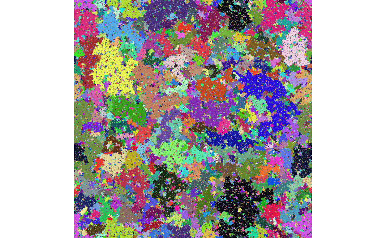
Figure 1: An image of percolation groupings
The above image shows that grouping by colors emerges “naturally” which provides the basis for generating clusters within the whole area under study. Generally, this whole process is obtained from a process which follows “cellular automata” from a random variable.11 Interestingly this is true for most geospatially organized data universally.
An example of how this process is applied to Great Britain (using income as the variable) is shown in the image below:
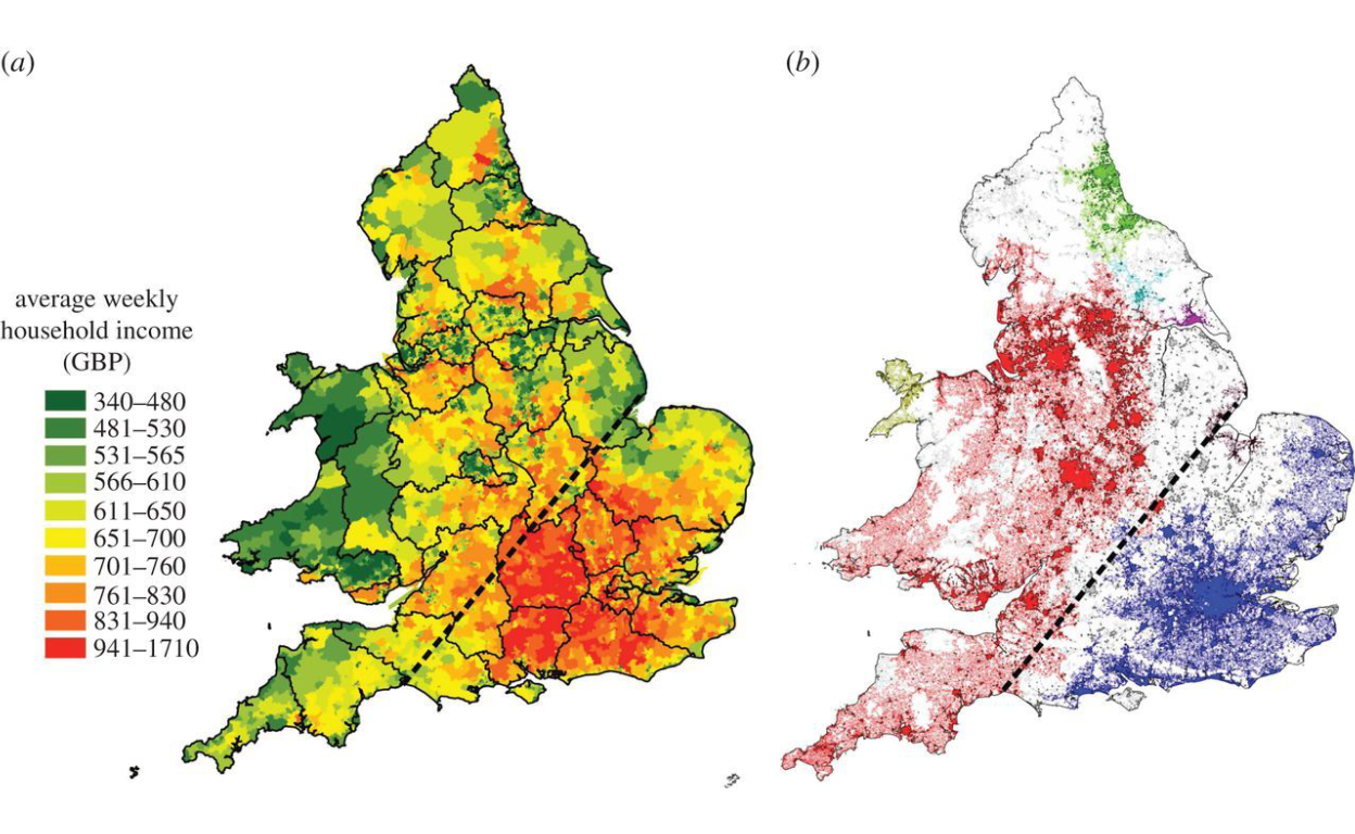
Figure 2: Percolation process applied to Great Britain (Source: Arcaute et. al (2016))
The cellular automata, despite being purely random at its most granular level have hierarchical structure - which makes it “tractable”, and the hierarchy looks like a “tree structure”, which makes statistical analysis applicable because of the existence of ordering in the system.
To demonstrate the meaning of this we present a sample of a hierarchical tree for Great Britain as enclosed below:
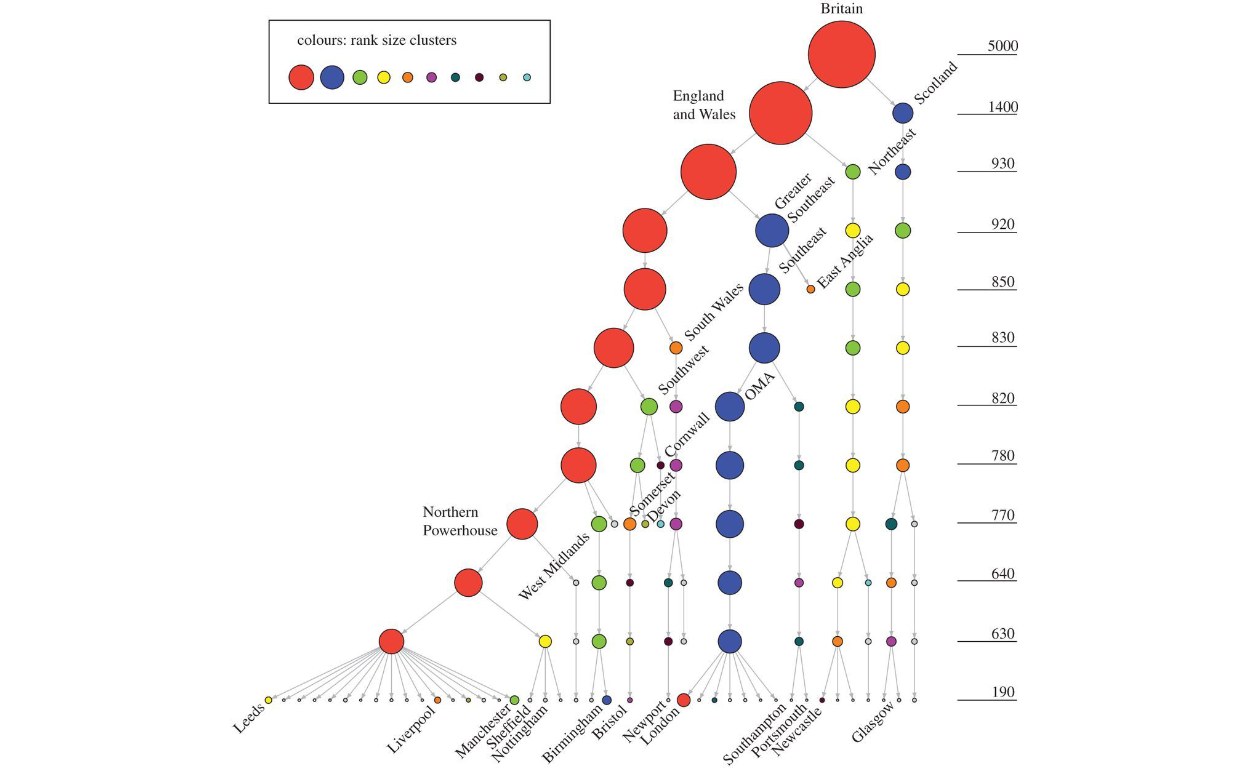
Figure 3: Hierarchical clusters applied to Great Britain (Source: Arcaute et. al (2016))
As shown in the figure above, the analytical process could be done on the “whole” of Great Britain, or any parts of the whole (e.g. Liverpool or areas within Liverpool), without any loss of connectivity and relations to the whole.
Using the theoretical basis as explained, the base algorithms are to generate this process for the whole area under study and generate the most granular clusters which contain the most rudimentary level of percolation as the principle. The “clusterings” generated through this process is termed as “smart clustering process”, which has its structural properties through the hierarchies. In network theory terms, what we have now is “network structures” whereby the clusters at any hierarchical levels are the “nodes” of the networks, and all characteristics of these clusters are the attributes of the nodes, and all the possible relationships between any clusters, at all level of hierarchies, are the edges of the networks. Furthermore, since all these processes are created or generated with the spatial positions, then what we have is a fully defined complex network of all possibilities of combinations and relations.
The task is then is to aggregate as much data and information as possible to be attributed to the clusters (nodes) and the relations (edges), whether they are static data or dynamic (i.e. real-time), and whether they have temporal (time) elements or not. Since all the process now is performed through algorithms rather than a human decision (except for the basic assumptions as starting conditions), the whole process is then a “smart process” or AI-driven process. This automata then allows lots more capabilities for the process to handle, in particular, to take Big Data feeds as input for the process, simultaneously and multi-sources inputs from IoT devices and sensors, or to handle a large number of users simultaneously (such as traffic management), or many other algorithms which involve massive computing or data process.12
The key step in our “smart cities” algorithm is to generate these “smart networks” or “smart layers”, which will be the base for any other higher-level abstractions or algorithms. Examples of abstract algorithms are mobile applications for e-hailing, online business, logistics and delivery, marketing strategies; similarly, the process could be applied to the disease spreading management (such as Covid-19 pandemics), disaster response management, crime prevention and management, and numerous others. If the objective is for the data and information feeds for city planners or city administrators, the networks are used as its base structure. In short, for any applications or use cases, the basic layers and structures are always the same; the only difference is the specific application or use cases.
Now we will proceed in a step-by-step process and document the results for the sample case in use here which is for Greater Klang Valley, Putrajaya, and Selangor.
Spatial microsimulations
The first step of the process is to perform “spatial micro-simulation” to generate what is called as “synthetic micro-data” of the areas under study. This is the first part of the process. Before proceeding deeper into the process, we need to have some broad understanding of the city or urban planning process.
Town and country or city planning generally start with “space definitions” where areas are zoned for various land uses and activities defined for the designated spaces. This had been the main methods which are applied to cities across the world. For the case of the Greater Klang Valley and Selangor, this duty is undertaken by Dewan Bandaraya Kuala Lumpur (DBKL) and Selangor state government through the various municipal councils.
Figure 4: KL2020 Masterplan. (Source: www.dbkl.gov.my/pskl2020)
The planning maps of Jabatan Pembangunan Bandar dan Desa, which covers all areas in the country, follows similar approaches.13. Samples of planning map for Majlis Perbandaran Ampang Jaya is enclosed below:
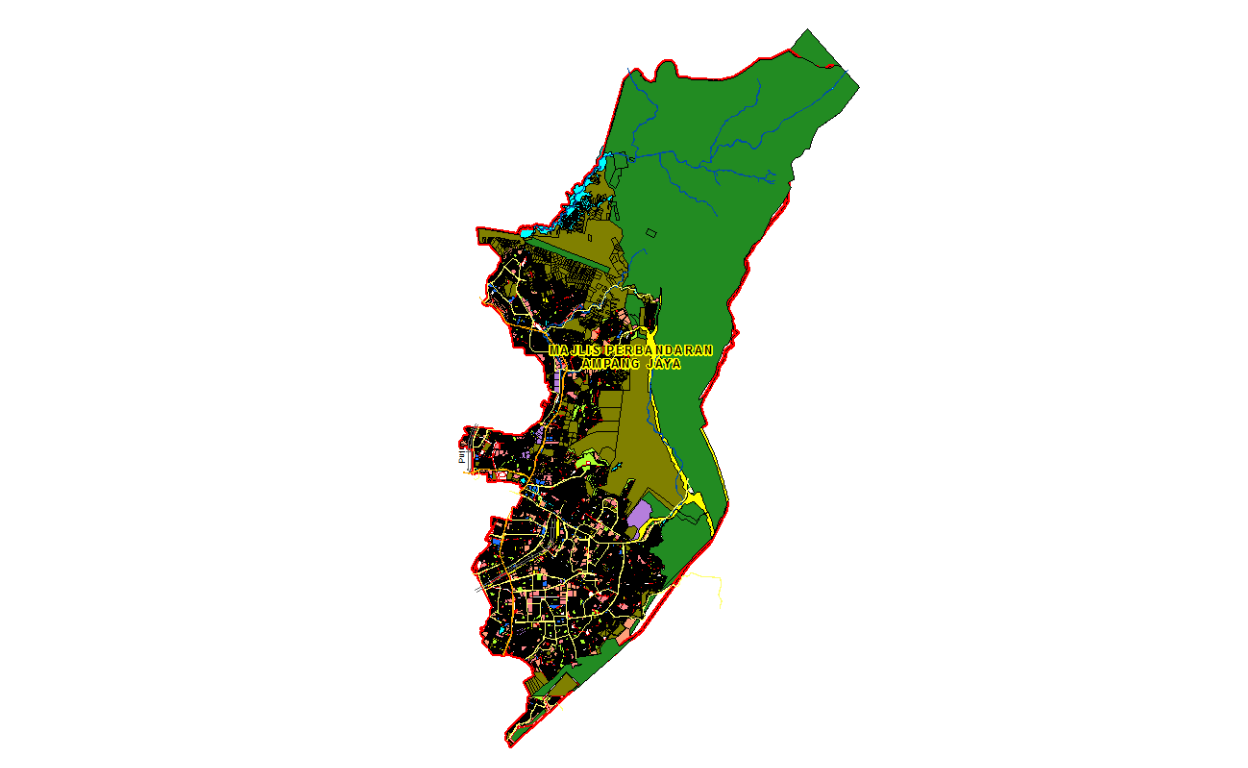
Figure 5: MPAJ Masterplan: (Source: http://sismaps.jpbdselangor.gov.my/sismapsv2/PenggunaAwam/RTAmpangJaya/viewer/)
Here we enclosed a “zoomed” view on part of the same planning map.
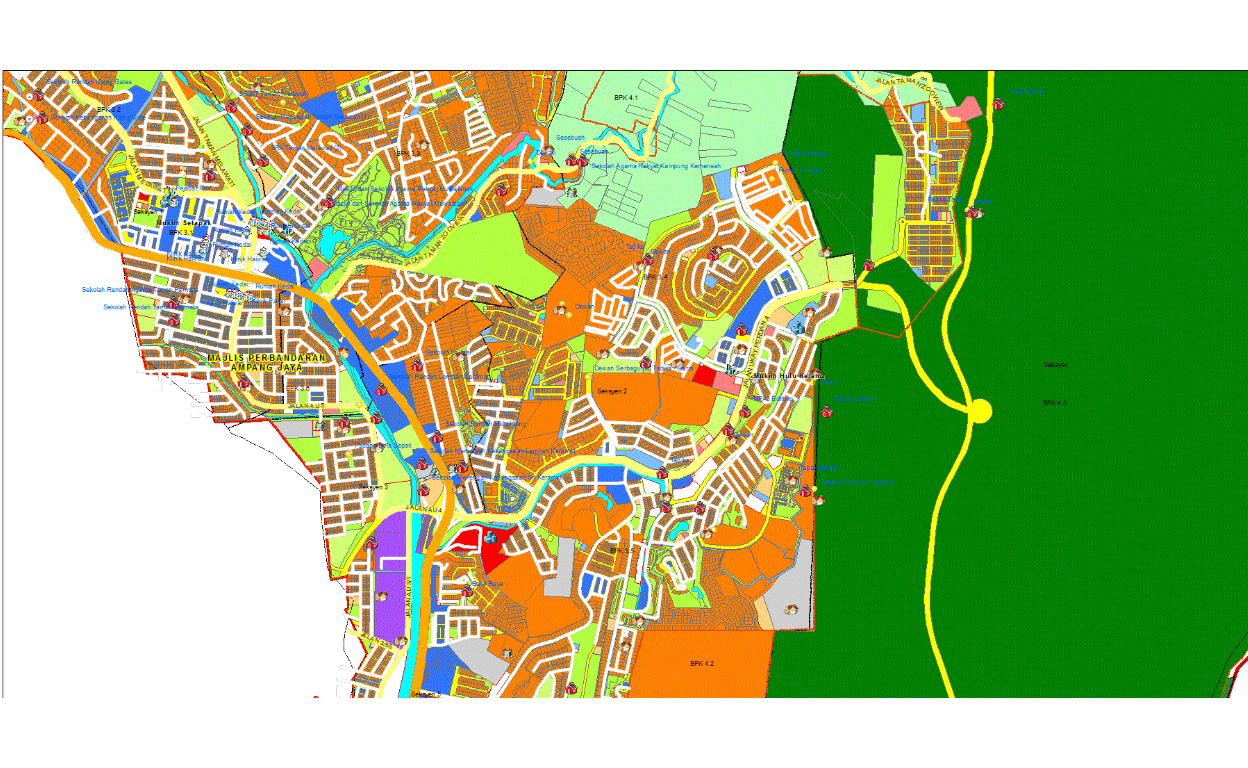
Figure 6: (MPAJ Masterplan: (Source: http://sismaps.jpbdselangor.gov.my/sismapsv2/PenggunaAwam/RTAmpangJaya/viewer/)
These maps and other planning maps while useful lacks few elements - namely it provides only the “space” elements, but lacks the rest of the subject matter of interest, which is the attributes, meaningful groupings according to socio-economic activities, demographic elements, and other meaningful layers (for purpose of analytics). Most importantly, while having all the data and information to granular levels, it lacks the network elements. They are generated as “static” maps which miss many granular points which are an important part of the modeling process. As an example, areas which are labeled as “offices” may be in combination with “residences”, and without the information of the density of the “build” as well as the population within a temporal domain (such as day and night, weekdays versus weekends), the information provided could only be used as a guide, but not in modeling. For these reasons, our approach here is different from the traditional GIS approach and instead we build the foundation layers from scratch using these granular data as our input. Unfortunately, there are no readily data that are available from these GIS planning maps that we could use, therefore we have to resort to obtaining data from Big Data sources and reverse backward to create “synthetic spatial data” as we will perform here.
The process to generate synthetic spatial data is called “spatial microsimulation”. As described by Lovelace (2016), “Spatial microsimulation is a way to combine the advantages of individual-level data with the geographical specificity of geographical data. If used correctly, it can be used to provide ‘the best of both worlds’ of available data by combining them into a single analysis. Spatial microsimulation should, therefore, be used in situations where you have access to individual and area-level data but no means of combining them. It can provide new insights into complex problems and, ultimately, lead to better decision-making. By shedding new light on existing information, the methods can help shift decision-making processes away from ideological bias and towards evidence-based policy.” “Available datasets often lack the spatial or temporal resolution required to understand complex processes. Publicly available datasets frequently miss key attributes, such as income. Even when high-quality data is made available, it can be very difficult for others to check or reproduce results based on them. Strict conditions inhibiting data access and use are aimed at protecting citizen privacy but can also serve to block democratic and enlightened decision making.”14.
Spatial microsimulation is defined as a method for generating spatial microdata — individuals allocated to zones — by combining individual and geographically aggregated datasets. In this interpretation, “spatial microsimulation” is roughly synonymous with “population synthesis”. And it is an approach to understanding multi-level phenomena based on spatial microdata — simulated or real. The process involved taking geographically aggregated data and various survey data (such as the population census and planning data) and combined them into spatially driven micro-data. This is explained in the attached figure.
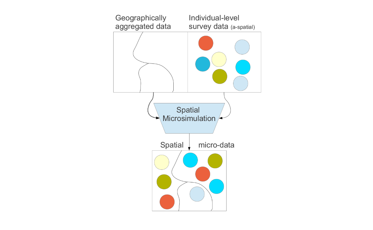
Figure 7: Microsimulations process (Source: Lovelace and Dumont (2016))
Based on these approaches, what we attempt here is to generate this spatial micro-data at the most granular level for the whole Greater Klang Valley, Putrajaya, and Selangor state. Before we proceed we need to provide a few caution and caveats - namely, we have to start with some starting point, and the choice of starting point may bias some of our results, and all the data that we used are generated from various sources which may have their own biases based on the methodologies used to generate such data. Details of methodologies of each dataset used are available in the documentation provided by the data providers or source of data. For saving space and discussions, please refer to each datasets reference provided.
The rest of the sections provide the steps taken to generate the data and convert them onto a spatial network structure, which is then ready for usage in various use case analytics.
Build layers
We will start with what we called the primary “build layers” for the area under study. The raw data is derived from various sources such as data compiled by Facebook for the demography, Global Assessment Report (GAR) provided by Human Data Organization15, various satellite driven data from Socioeconomic Data and Application Center (SEDAC)16, European Space Agency (ESA) open data access17, furthermore, we also rely on OpenStreetMap data18, and numerous other sources of data. These raw data are further processed using our methods of data cleaning and aggregations as well as validations.19
The basic layer is the population layer, where we compile the data from square grids of 100 meters by 100 meters.
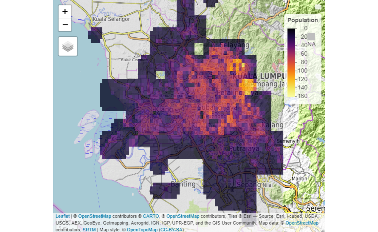
Figure 8: Population Layer
Furthermore, we developed what we termed as the network (ranking layer) and socio-economic measures layers.
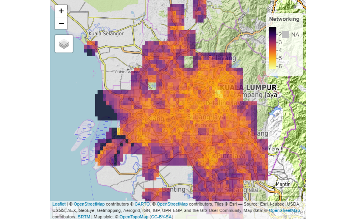
Figure 9: Network rankings
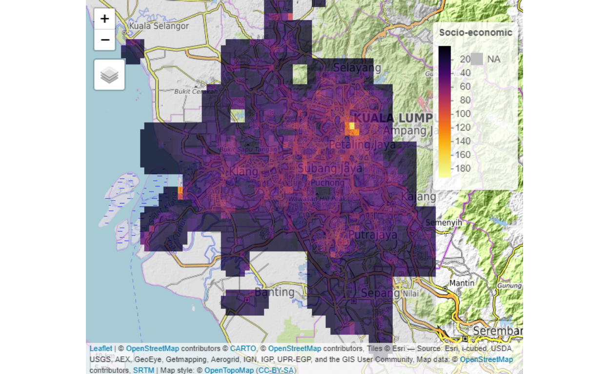
Figure 10: Socio-economic ranking
The layers are generated on a refine 100 meter by 100-meter grids of the area. Within each grid point, we generated meta-data referencing, which will be used in various parts of the analysis.
Examples of secondary “build layers” are demographic components such as “number of children below 5 years of age”, type of components within a grid, such as the built-up components, land covers, land uses, and others.
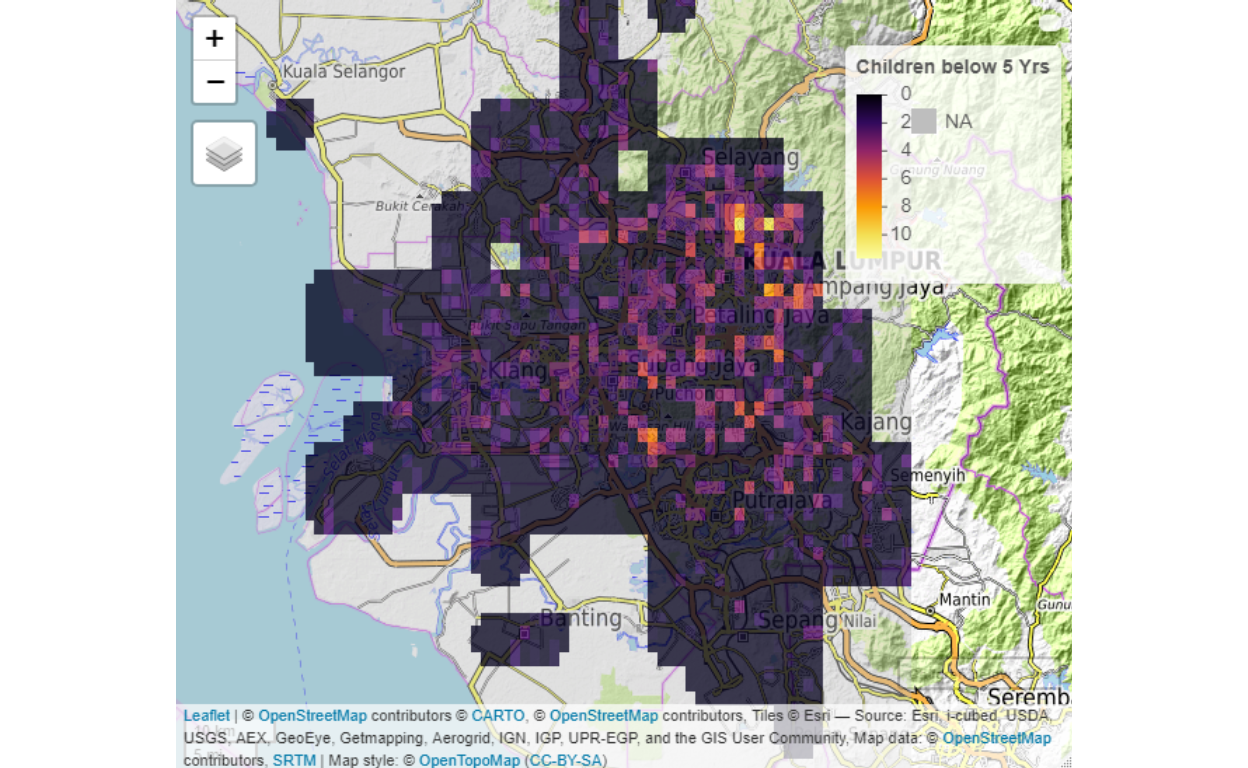
Figure 11: Children population
Three fundamental (or base) layers for spatial network analysis as defined by Batty (2018)(Batty 2018) are the population, the activities (economics), and the degree of the flows (networks). On top and above the three basic layers must be complemented with as many other dimensions as possible, guided by the objectives of the analysis and purpose of the “smart systems” to be developed.
Spatial networks
Spatial networks are defined by various factors - activities, types, classes, relations to other areas, and a few other relevant factors. These factors in turn determine “networked” relations with other areas. The “networked” element determines the “positions”, “flows” and “agglomerations” of each area based on temporal behaviors of the network.20
Referring back to various smart systems of “smart living”, “smart governance”, “smart people”, “smart mobility”, “smart economy”, and “smart environment”, behind it is the various networks which define smartness in each system. For example “smart mobility” is defined through the “mobility networks” of the city, similarly “smart economy” is defined by “socio-economic networks”, “smart people” is linked to “human networks” and so on. Since all of these networks exist and operate or understood within spatially defined space and time, the networks are defined to be “spatial networks” and time element is defined as “temporal” dimensions of the networks.
In Appendix A, we provide detail of the model’s notations for POI - Points of Interest (or Points of Importance), LOI - Location of Interest (or Location of Importance), and the networks formed as a composition of agents interacting within the networks. Out of which there are local networks generated, which is a fully connected network, with the ties defined by the edges, and the strength of the ties will depend on the weight of the edges (weak or strong ties), and if it involves “flows”, then the flows will be determined by the attributes which serve as the control of the flows between the Nodes (i.e. POI, LOI). And the greater network is also a fully connected network, with ties defined by the edges, similarly. Examples of the edges are traffic flows from one LOI to another, communication links, road links, etc., depending on the network in question or subject of interest. The full detail definitions of this types of networks and its definitions are found in Barabasi (2016)(Barabasi 2016), Newman (2010)(Newman 2010), and Jackson (2008)(Jackson 2008), and within the context of cities is provided by Batty (2013)(Batty 2013) and Barthelemy (2010)(Barthelemy 2010).
Normalization of raw data
Spatially aggregated data (and most spatially generated data) in general suffers from non-linearities, asymmetricities and does not follow stable gaussian statistical distributions. This is the first part of the problem to be dealt with in dealing with spatial data. The second problem will be the network structures, whether it exhibits “random graph structure” and other issues related to graph theories such as planarity and others.21
Here we first deal with the issues of statistical distributions and leave the issue of network structure for later treatments. In this section, we describe our process of data transformation that we will undertake. First, we provide a 3D view of the data:
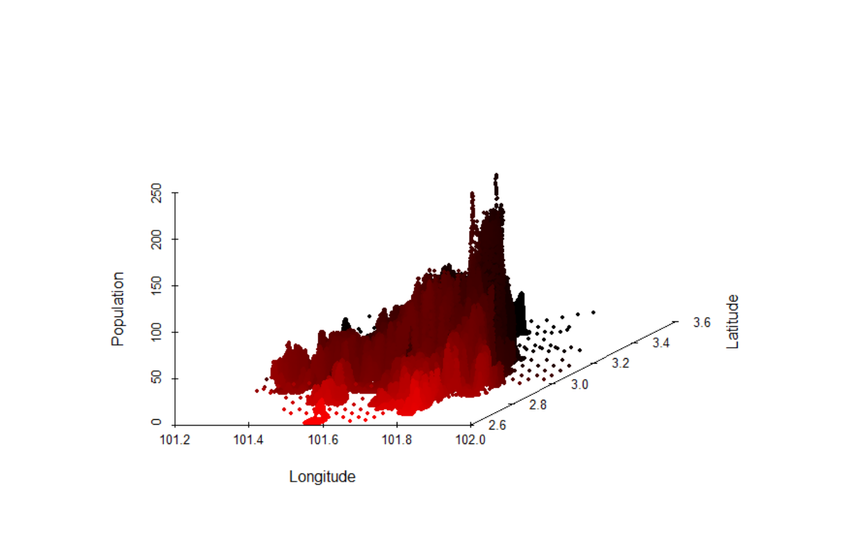
Figure 12: Population layer in 3D
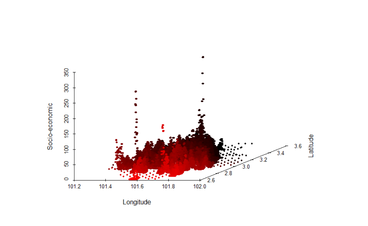
Figure 13: Socioeconomic layer in 3D
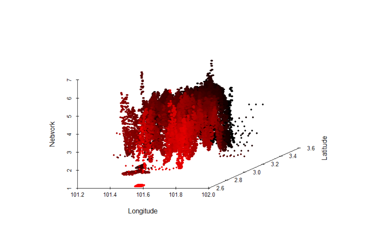
Figure 14: Network layer in 3D
The first process is to perform the normalizations of the raw data. This is accomplished by “re-scaling” of the various layers by performing a step-by-step process as described in the following sections.22
Intelligent clustering procedure
How do we determine the clusters (or boundaries) between various LOI? Could we rely on administrative boundaries defined by the authorities or do we have to use other methods of determinations? Cities and suburban areas are in constant evolution, due to many factors, such as access via transportation (roads and rails) and communications (internet and telephony). Furthermore, administrative “borders” within an urban setting are extremely ambiguous and yet contiguous. A clear example of this the “administrative borders” of Selangor and Wilayah Persekutuan Kuala Lumpur - where are the lines?
Furthermore, any method of clustering will introduce heterogeneity, due to the heterogeneous nature of areas - which would require careful methods to obtain clusters as homogenous as possible within its own set of clusters. For example, low rise residential areas are classed together with other low rise residential areas, or industrial areas with other industrial areas, and so on.23 Furthermore, we need to be cognizant of the underlying urban agglomeration of the network, which drives the socio-economic effects of the density of activities within the clusters. We need to consider the maximization of the homogeneity of the agglomeration process as well.
Neighbourhood selection methodology
To perform this task, we use an AI algorithm based on the layers described earlier and modeled them as a spatial network. Given the intensity of calculation, we will only perform “static”, and leave the spatiotemporal analysis for later works. The method used is called “contiguity based spatial weights”. We also choose the “Queen” method instead of the “Rook” method, which implies a much more rigorous contiguity measure (i.e. more generalized). The objective of the process is to generate areas of the neighborhood such that, the attributes of each area would have higher similarities with each other, selected from the nearby sub-areas. Higher similarity sub-areas then would be aggregated into a bigger area, which we define as the major areas or clusters.24
Here, what is normally done is to use the most granular (smallest) census block as the base; since we do not have such data available, we resort to using the “voting blocks” obtained from the election boundaries for Wilayah Persekutuan and Selangor. These blocks are the closest that we could get to a census block since, by definition, an election boundary (physical boundaries) is created through a census process.25 There are altogether 1,120 sub-clusters in the data.
First, let us understand the statistical aspects of these base sub-clusters. The simplest way is to perform a simple Generalized Linear Model test on the data and analyze the results. What we want to test here is whether the relations population and the size of the area (of the sub-clusters) on a log-log scale is linearly related.26
The test results are presented below as a plot of the linear model :
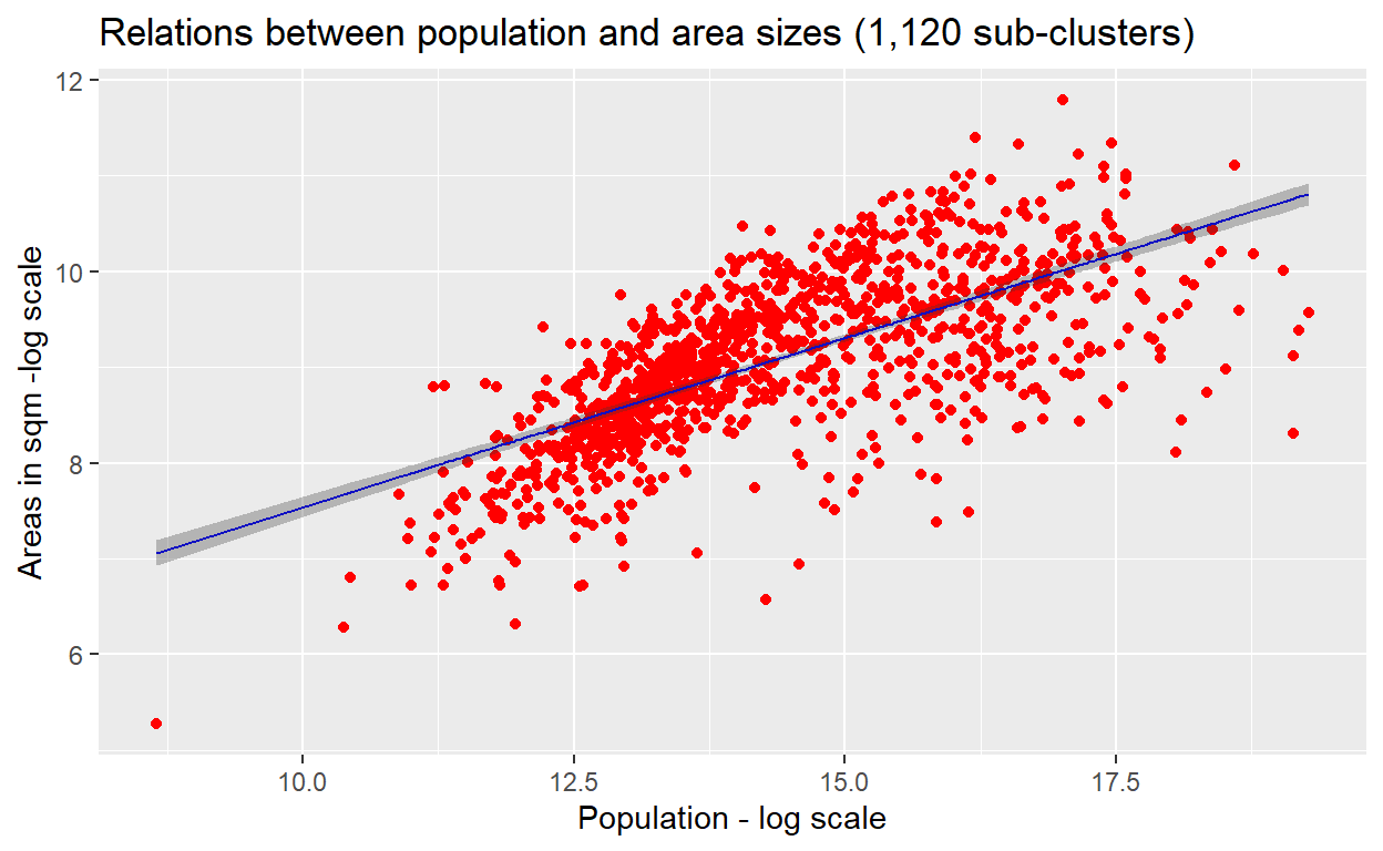
Figure 15: Linear Model
The result shows that while there is a clear trend of relations, whereby there is underestimation for the lower values observations and overestimations as well as underestimations for the higher values observations.
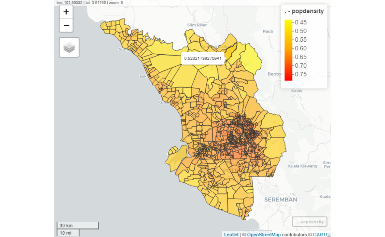
Figure 16: Clusters map
As we can see from the plot above, the sub-clusters are denser in the highly populated areas (mainly in Kuala Lumpur) and sparse in the less populated areas (mainly in Selangor). The shades of colors represent the population densities (in log scale).
With this background in mind, we then run the algorithms to “choose” and “group” these sub-clusters into larger grouping (i.e grouped into the larger size of areas and populations). The objective of the process is to reduce the 1,120 sub-clusters by grouping them into larger cluster sizes (i.e. lesser number of clusters).
This reduction process is called “contiguity based grouping”. We perform knn-means (using spdep package in R) classification process to generate the contiguity measures for all the 1,120 sub-clusters and plot the results on the geo-coordinates as shown below:
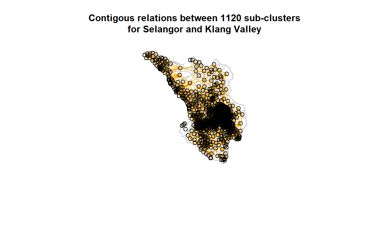
Figure 17: Contigous relations between clusters
The denser areas are more contiguous than the lesser dense areas. In any case, now we could feed the measures of the contiguity into the network of 1,120 by 1,120 nodes, whereby the contiguity measures are the edges between the nodes. Clearly, some of the nodes will have zero connections (i.e. no contiguous neighbors), while some will be higher.
Now we feed this network into graph algorithms (using iGraph package in R or using Gephi) to calculate the network statistics (or measures). In particular, we want to find the optimal sub-graph among the nodes (based on the edges). In particular, we calculate the graph “modularity” and determine the optimal grouping based on the modularity classes for the nodes (i.e. clusters). The modularity measures are then used to generate the bins over all the clusters, and we use it for “coloring the nodes” of the network as shown in the attached figures. This process results in creations of 90 clusters (represented by the different colorings). The results are shown in the plot below:
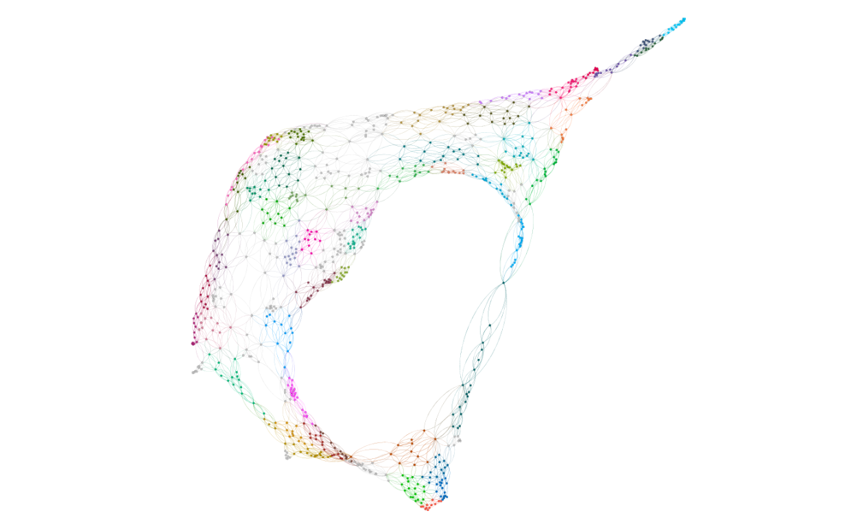
Figure 18: Network modularity of sub-clusters (from Gephi)
The set of colors represents groups with similar modularity. Furthermore, the sub-clusters follows almost random graph structures.27
Based on the process described, we decided that the final (i.e. optimal) distinct grouping, based on the optimal selection of clusters of 90 major clusters. Now lets us report the structure of these 90 major clusters by first presenting the results as a plot below:
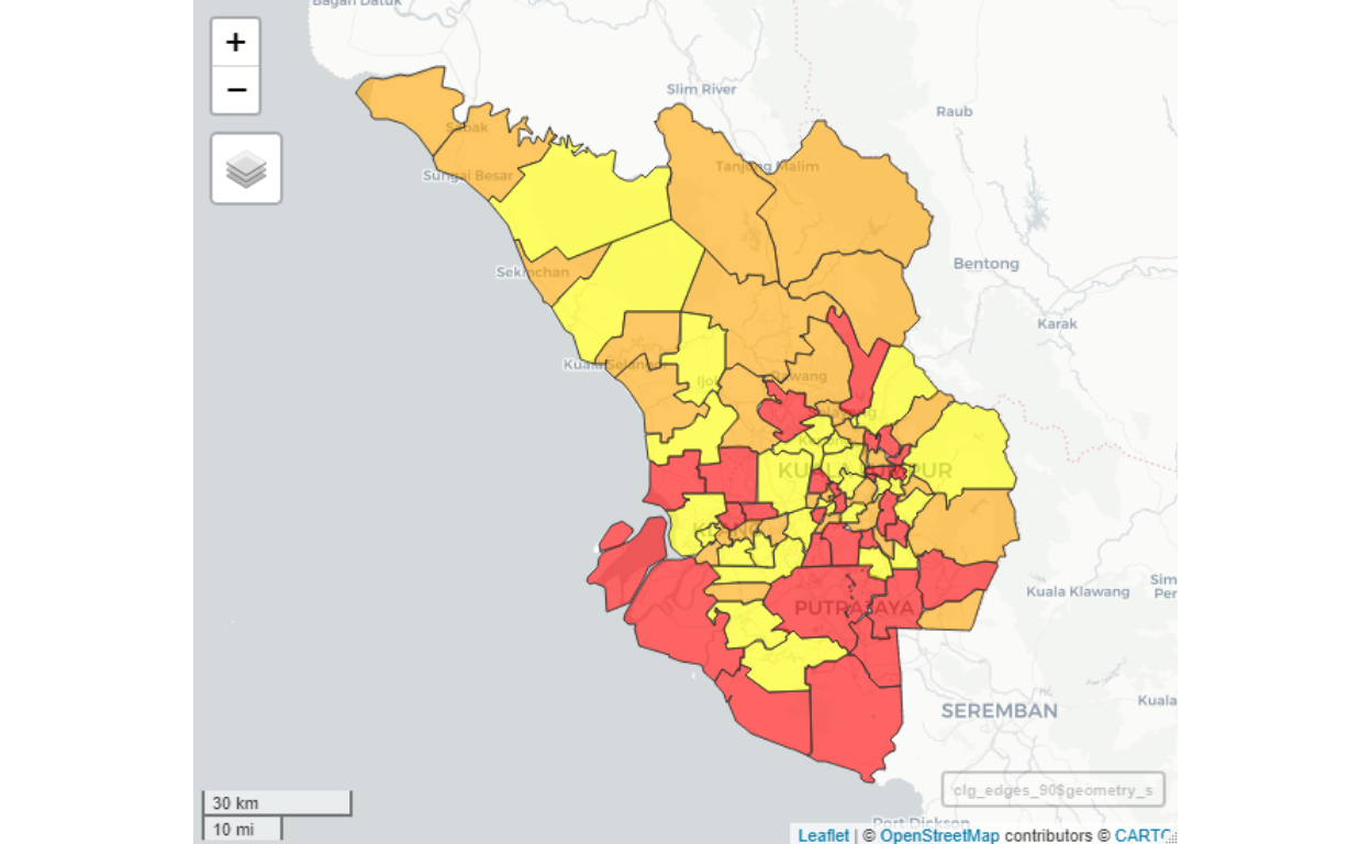
Figure 19: Map of major clusters
Comparing this plot to Figure 16, we can see that now the cluster sizes are larger (hence lesser number of nodes), and yet it maintains a clear and meaningful grouping process.
Now we need to test whether the linear relations as evidenced in sub-clusters are still maintained to a large degree. This is presented as the results of the linear model test shown in the plot below (note that we will use a log-log scale as the variables):
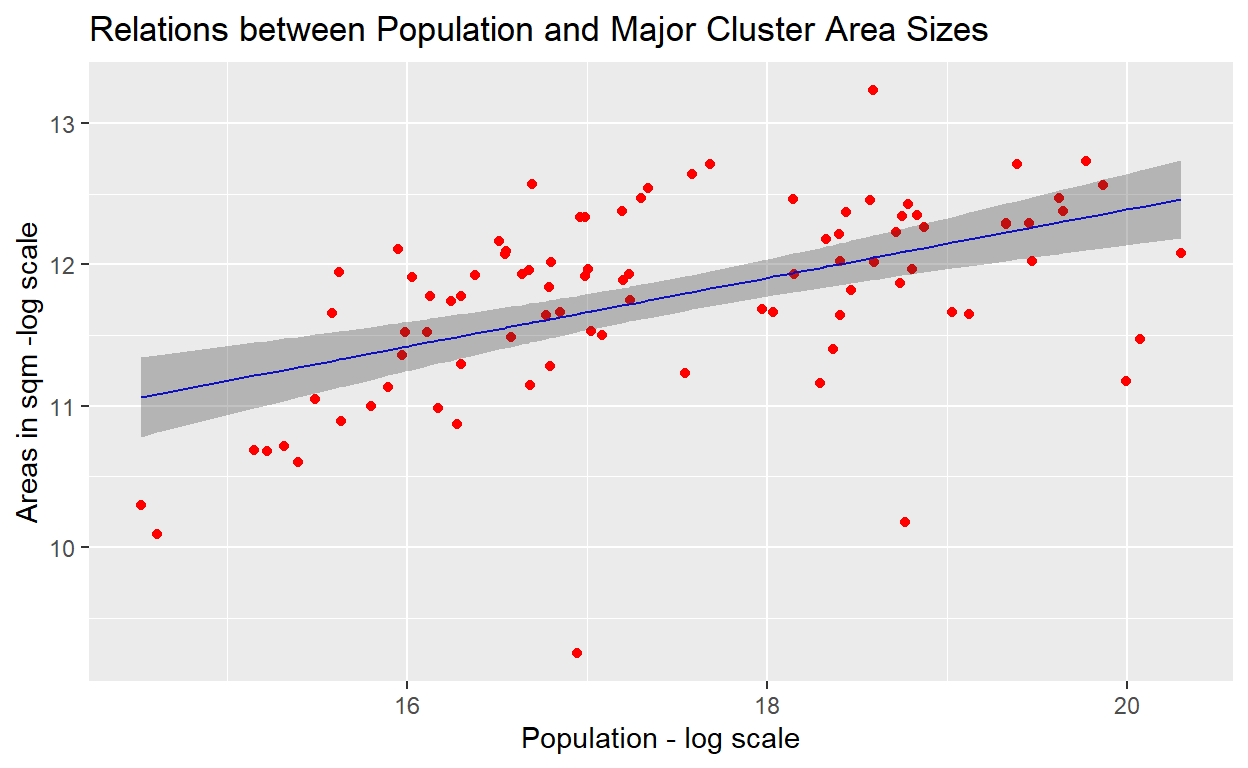
Figure 20: Linear model plot
The GLM test results provides confirmation of the log-log scale linear relationships between the areas and population for the clusters is maintained, albiet there are still some observations which are a bit on the extremes. We will deal with this issue a bit later. To see the overall population densities in the newly formed clusters, we provide the density plot as shown below:
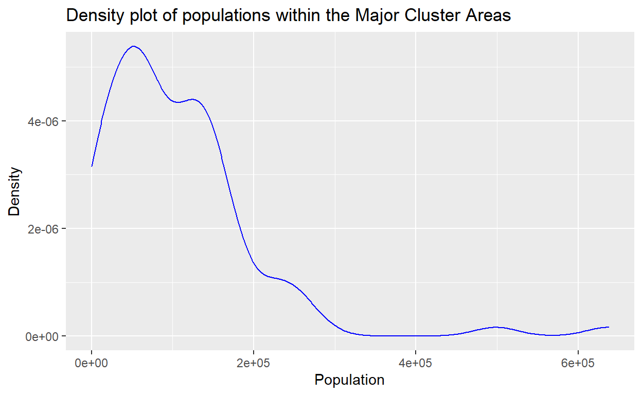
Figure 21: Population density plot
We note that population density seems to follow a truncated gamma type of distributions, which is in confirmation with the studies reported by Batty (2013)(Batty 2013) and Barthelemy (2010)(Barthelemy 2010); an observation which is emergent in most of the major cities of the world. This provides some validation to our clustering process.
Validation of neighborhood clustering process
To further validate the process, we will run a few tests which results are shown here.
Generalized Linear Model test
First, we perform a Generalized Linear Model testing on the data by using the cluster classes as the predictor variable and the population density as the independent variable. The result of the test is provided below:28
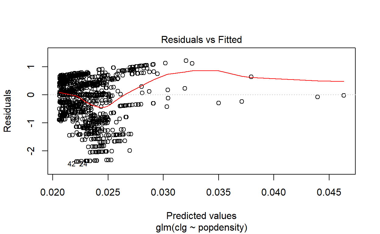
Figure 22: Generalized Linear Model (GLM) plot
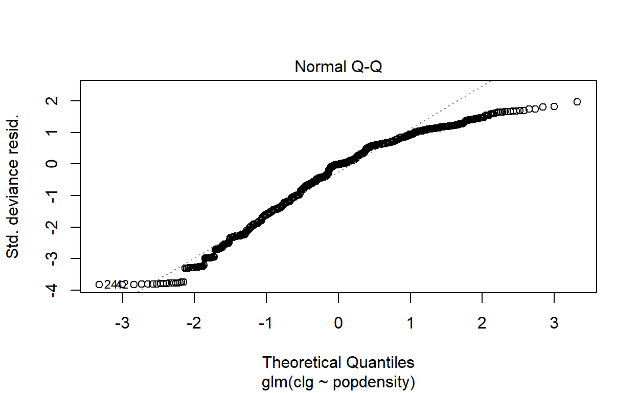
Figure 23: Generalized Linear Model (GLM) plot
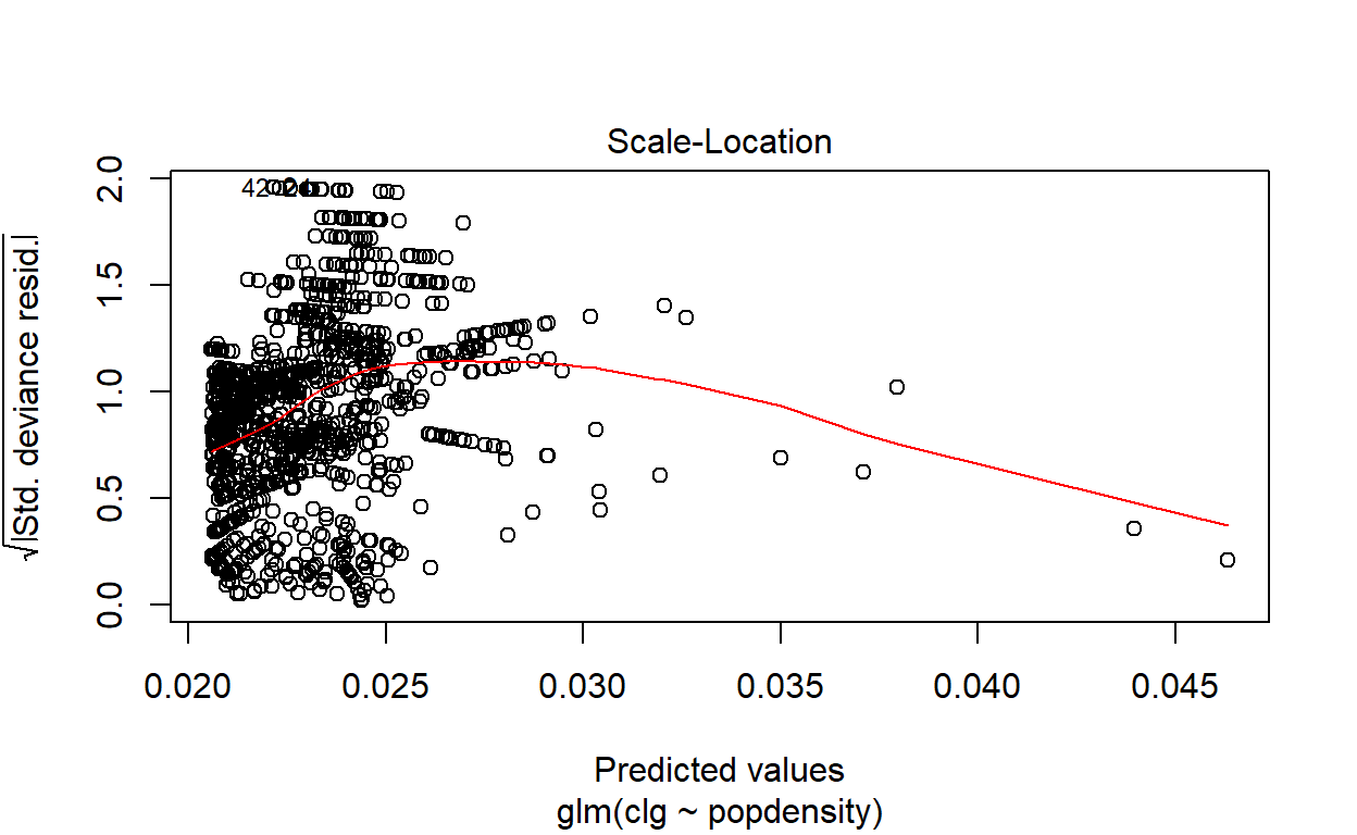
Figure 24: Generalized Linear Model (GLM) plot
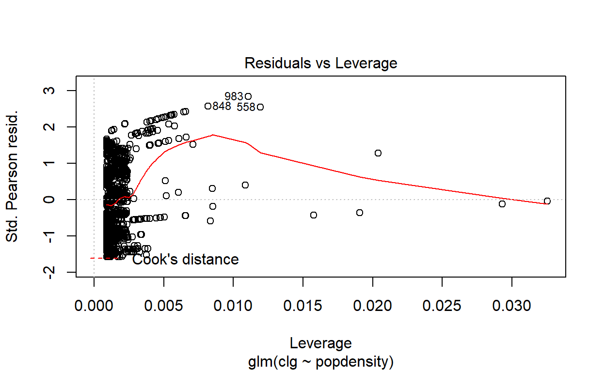
Figure 25: Generalized Linear Model (GLM) plot
The result shows that while at lower population density (i.e. lesser dense areas), the relationship (on a log-log scale) is linear; however at higher population densities, the model would grossly underestimate the relationship. This phenomenon is common in most other cities in the world. This provides evidence that the linear model can’t be used as predictions - which then calls for further refinements of the clusters’ classification process as being accomplished thus far. For this reason, we will resort to non-linear models of classifiers, which we will do next.
Clustering classification test
There are few methods of non-linear classification models (or tests) that are normally used for geospatial data, namely Random Forest, Support Vector Machines, or many forms of classification regression methods. Here we perform such process using partition regression using rpart package in R.29 The results are as provided in the plot below:
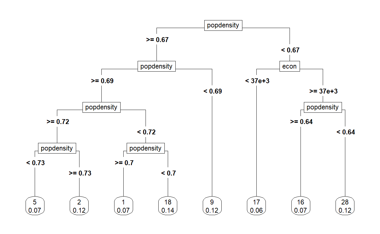
Figure 26: Classification tree plot
The plot above reveals that the clusters generated from earlier process could be further sub-classified by the population density and “economic intensity” measures. The rules derived are as follows:
| Sub-classifications | Label | Cumulative Rules | Number of Clusters |
|---|---|---|---|
| 1. High population density | A. pop density => 0.671 | ||
| 1.1 High-Medium density | A.1 pop density => 0.691 | ||
| 1.1.1 High | A.1.1 pop density => 0.716 | ||
| 1.1.1.1 Higher | gkv_hdh | A.1.1.1 pop density => 0.73 | 8 |
| 1.1.1.2 Lower | gkv_hdl | A.1.1.1 pop density < 0.73 | 14 |
| 1.1.2 Medium | A.1.2 pop density < 0.716 | ||
| 1.1.2.1 Higher | gkv_mdh | A.1.2.1 pop density => 0.696 | 14 |
| 1.1.2.1 Lower | gkv_mdl | A.1.2.1 pop density < 0.696 | 7 |
| 1.2 Low density | gkv_ldd | A.1 pop density < 0.691 | 8 |
| 2. Low population density | B. pop density < 0.671 | ||
| 2.1 Higher econ | B.1 econ => 36719 | ||
| 2.1.1 Higher density | sel_hdd | B.1.1 pop density => 0.642 | 15 |
| 2.1.2 Lower density | sel_mdd | B.1.2 pop density < 0.642 | 8 |
| 2.2 Lower econ | sel_ldd | B.2 econ < 36719 | 16 |
To give some idea about the grouping, here are some samples:
| Label | Sample areas |
|---|---|
| gkv_hdh | Kepong, Gombak,Wangsa Maju, Ampang and Seri Kembangan |
| gkv_hdl | Bangsar, Maluri, Subang Jaya, Puchong, Bdr Sri Damansara |
| gkv_mdh | Taman Wahyu Jalan Ipoh, Seputeh, Kajang, Kelana Jaya |
| gkv_mdl | Selayang, Cheras, Pelabuhan Kelang |
| gkv_ldd | Pudu/Imbi, Kepong Utara, PJ Jalan Universiti, Kota Kemuning |
| sel_hdd | Bangi, Hulu Klang, Rawang, Meru, Gombak, Cyberjaya |
| sel_mdd | Banting, Sepang, Kapar, KLIA, Sijangkang |
| sel_ldd | Kuala Kubu Bharu, Tg Karang, Kuala Selangor, Ijok |
Plot of the map of the clusters based on the labels is enclosed:
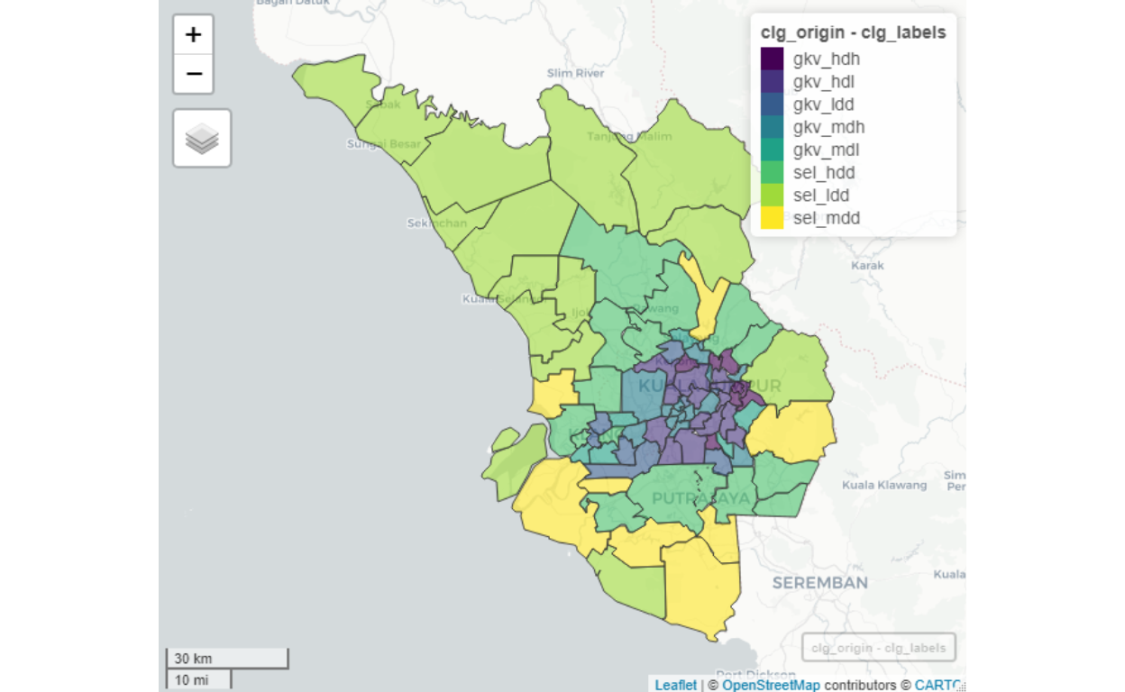
Figure 27: Cluster by origins
We can see clear indications of highly dense cluster groups are more towards the center of GKV, and as we move away from the center towards remote areas in Selangor, the density tapers down. Furthermore, note as well as the “administrative boundaries” are blurred. Some areas, such as Putrajaya would include Cyberjaya within it. As well as when we look at areas in Petaling Jaya (which consists of a lot of dense areas) are divided in ways that are not per generally understood administrative structures. For example, Universiti Malaya is grouped in the same grouping of Bangsar and Damansara instead of PJ Jalan Universiti, despite administratively it is under Petaling Jaya (as commonly known or understood). The main reason for this is due to our algorithm of “choosing neighbors” as we described here - where the methods of determining an area (or a neighborhood) are based on the measure of contiguities and network modularity, rather than administrative as described earlier.
Spatial measures (or weights)
Now that we have defined the major cluster groupings, we will then create measures for each cluster grouping, which among others are as follows:
- The area (in square meters)
- Total population (population)
- Ranks of “socio-economic” in the total network (econ)
- Relative ranking “network importance” (within the entire network)
Here we provide some sample visualization of summaries of these measures.
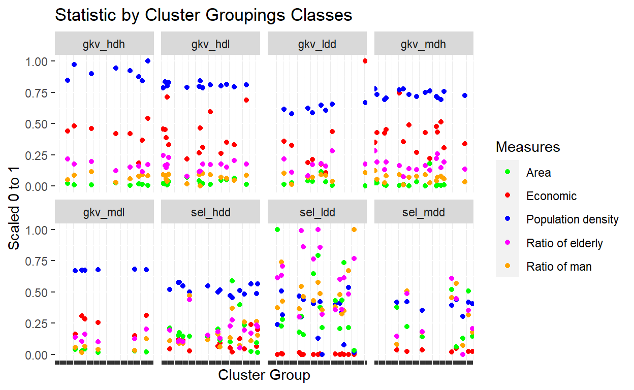
Figure 28: Statistics by cluster groupings
We can see that the various measures differ across classes of cluster groupings indicated in the above plot. Of particular interest would be the relationship between the economic ranking measures across cluster groupings, as well as the ratio of man and elderly in the population.
Next we investigate the correlations between various measures, as demonstrated in the plot below:
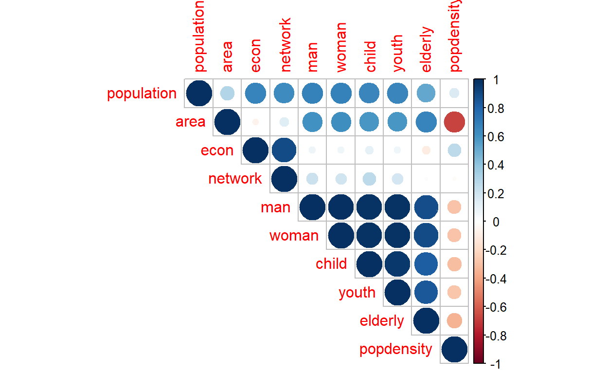
Figure 29: Correlation matrix across clusters
Of interest is again the correlation (or lack of it) between economic and network with the rest of the variables.
In conclusion, the tests validate our process of “intelligent clustering” process which now generates 90 clusters for the areas under study, whereby these 90 areas are generated through the smart process, hence we could then use them as “smart clusters” in our model.30
Spatial network formation
Now we will perform the next process in generating the relations between these clusters (90 clusters) within a network of connectivity settings.
As explained earlier, geo-clusters as formed in the earlier section are related to each other in some forms; and the most basic relation is physical connectivities. In the case of the area under study (and in Malaysia generally), the main connections are the roads. Of course, there are other forms of physical connections, such as railways or riverways, which could be added on a later stage. Other forms of connection are the digital network (such as fiber optics and telecommunication facilities), utility networks (such as power lines, cables, and grids; water distributions). Another dimension of interest could be the elevation and topographic data.
Since the types of data and information are vast and generally not available as open data, we have to rely mainly on the road data. For this, we will rely on OpenStreetMap data which possesses comprehensive geodata on almost all major road networks in the country. As published by the Malaysian Public Works Department (JKR), Malaysia’s road network covers 250,023 kilometers (155,357 mi), of which 248,067 kilometers (154,142 mi) is paved/unpaved roads, and 1,957 kilometers (1,216 mi) is expressways.31 Furthermore, the main mode of transport is by private vehicles (cars, motorcycles, buses, lorries, etc.); there are currently twenty-eight million private vehicles registered with the Malaysian Road Transport Department (JPJ), and of which there are about fourteen million cars and fourteen million motorcycles with active registration. In short, our assumption of using road networks as the main mode of connectivities is justified by the numbers.
Open Street Map road networks data
The data source that we will use is from Open Street Map (OSM) data. In terms of the major and main roads in Malaysia, OSM captured at least 95% of the data. The only lacking data are the gravel and non-paved roads. For our purpose, we consider that the data is sufficient since we are interested in the main connectivity between the clusters. Furthermore, OSM data also comes with the estimated “duration of travels” on the roads, and the road classifications are quite details - right from the Motorway (for highways), all the way to small “residential roads” at the neighborhood levels. The travel duration is also an open data provided by Open Street Route Map (OSRM), which is a complete route choices descriptions and the average duration of time taken from point to point on land, from any point to any other points in Malaysia.32
For the works here we rely on various packages in R Programming language, namely osmdata (Open Street Map data interface), OSRM (Open Street Route Map interface), and various r-spatial packages (OGR,rgdal,sp,sf,raster, and rgeos). And for reference, we use methods of geocomputations as presented by Lovelace (2019)(Robin Lovelace 2019) and Bivand et. al (2008)(Roger S. Bivand 2008). Fortunately, R programming language has developed to become one of the most comprehensive open-source GIS programming languages available today.
Now we will describe our process of creating the “road networks” as follows.
First, we create a network of “all possible relations” between all the 90 cluster groupings, which will result in a fully connected undirected network of 8100 (90 x90) relations. The cluster groupings are classified as the “nodes or vertexes” and the relations are defined as the “edges or links”.We will then find the “shortest path” as our measure and calculate the distance and time required to move from one area to another. Since an area is defined by a polygon, we will then use the “centroid” of the polygon as our starting or ending destination.33
We will label the nodes either as “Origin” or “Destination” as a bi-directed graph (or dyadic graphs), and the shortest road link as the edges. There are all possible 90 nodes and 8100 edges in the network.34 The picture of the road networks is enclosed below:
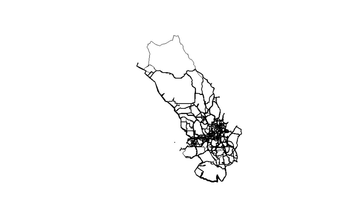
Figure 30: Road networks by degree of importance
We can see how the relations between areas, which are more dense in the central GKV, and sparse in the outer areas of Selangor.
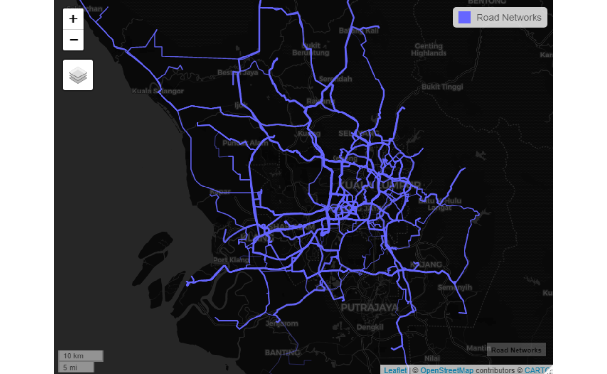
Figure 31: Road linkages between the clusters
Let us see other dimension from network measures point of view:
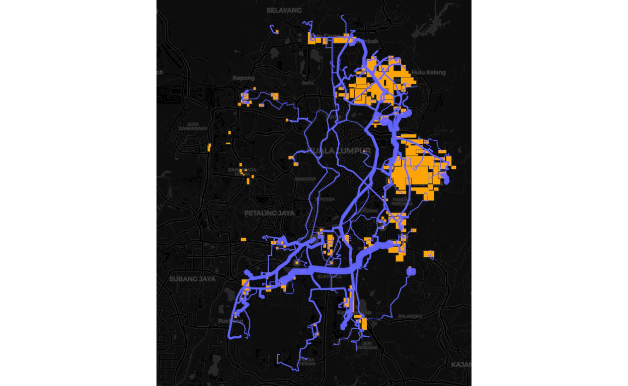
Figure 32: Plot of the network (by roads)
Picture of the road networks for the GKV, WPPJ and Selangor.
From the networks we compute various network centrality measures such as “closeness centrality”, “betweenness centrality”, and also we look at distance or durations of time to travel as well as “geodesic” distance between various clusters. Below we provide some plots of the various centrality measures.
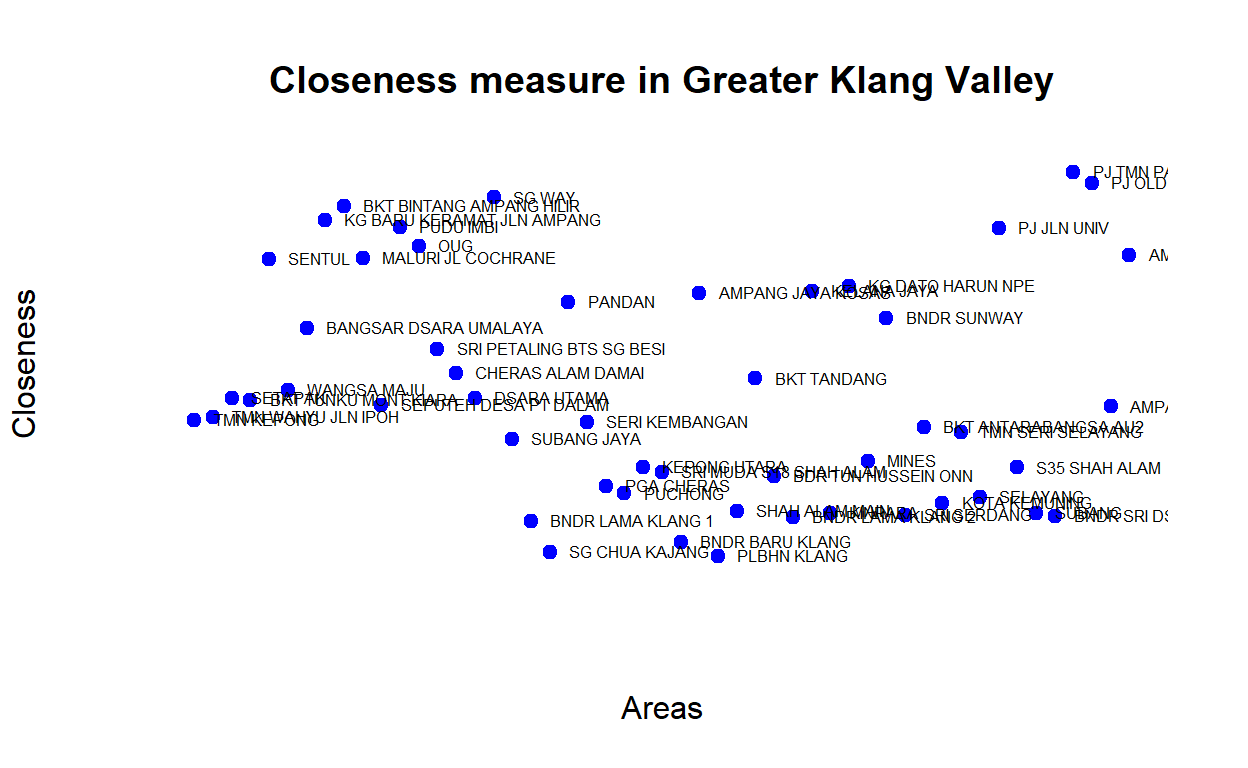
Figure 33: Closeness measures
The plot demonstrates that some areas are more centrally located (higher measures of closeness) - as an example Sungei Way is more centrally located than Bandar Baru Klang. Similarly, we can also check for betweenness whereby similar areas also have higher measures of betweennesss. The plot below provides the rankings based on network centrality (eigen vector centrality) measures for the various clusters:
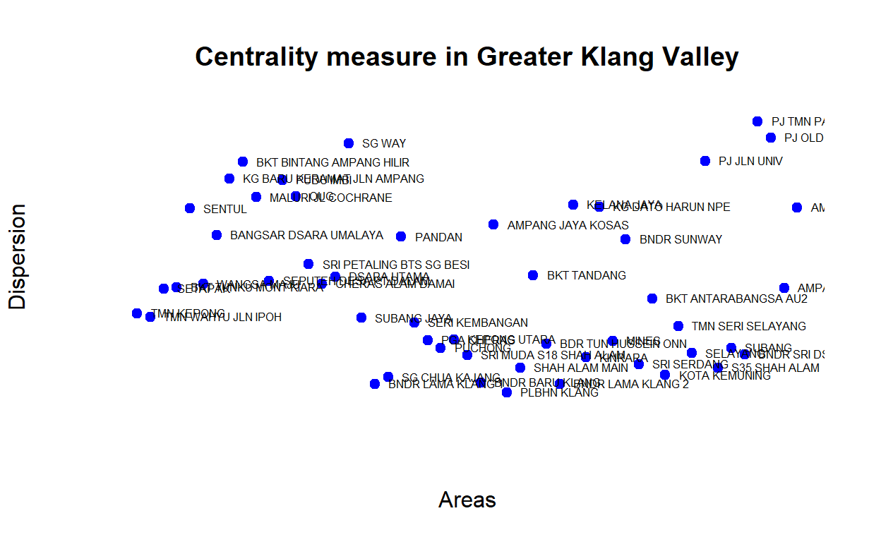
Figure 34: Centrality measures
Below we provide another view of the network dimension by rankings based on the average “shortest-path” (geodesic) measures between the major GKV clusters, as shown below:
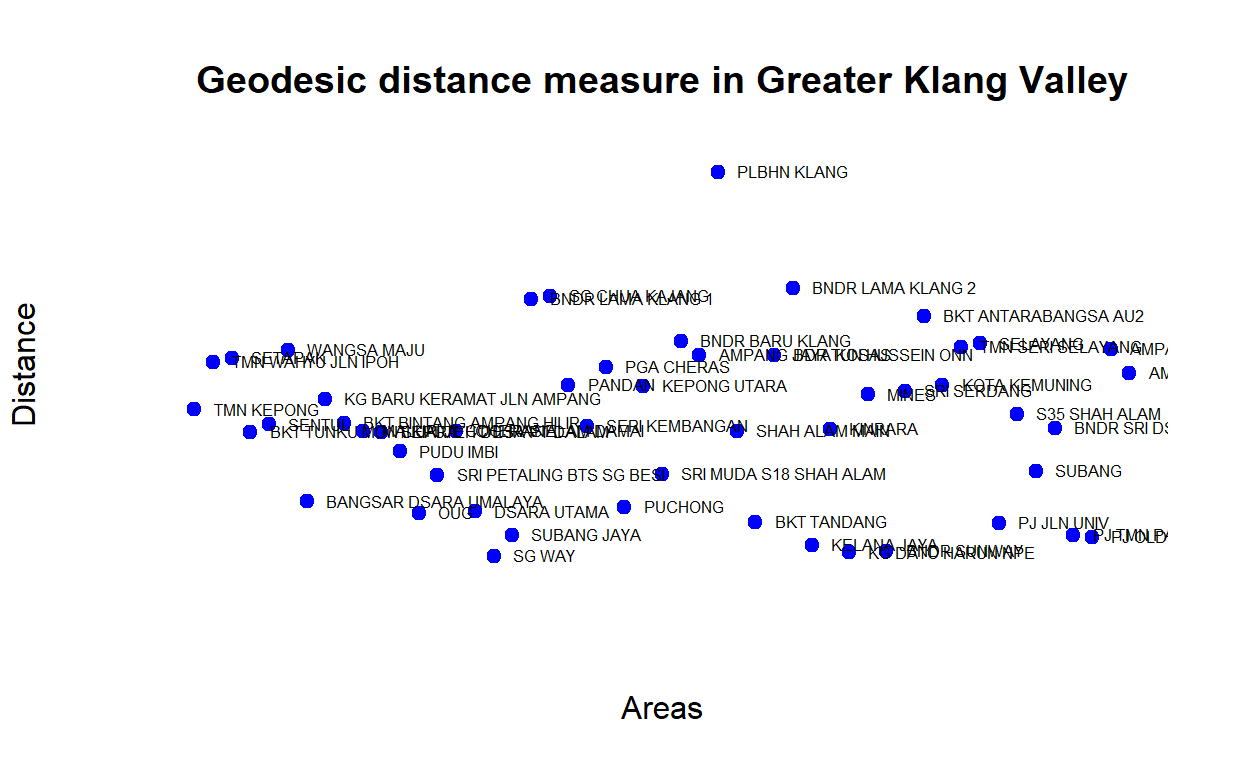
Figure 35: Shortest-paths measures
When we measure the average distance, we will see areas with higher “closeness” is in fact also closer in terms of geodesic distance (from all other areas on average). In another word, there seems to be an “inverse” relationship between distance versus closeness and dispersion. Areas that are relatively closer to the rest exhibits higher dispersion rates. The plot below provides a view of the network dispersion measures for the GKV clusters:
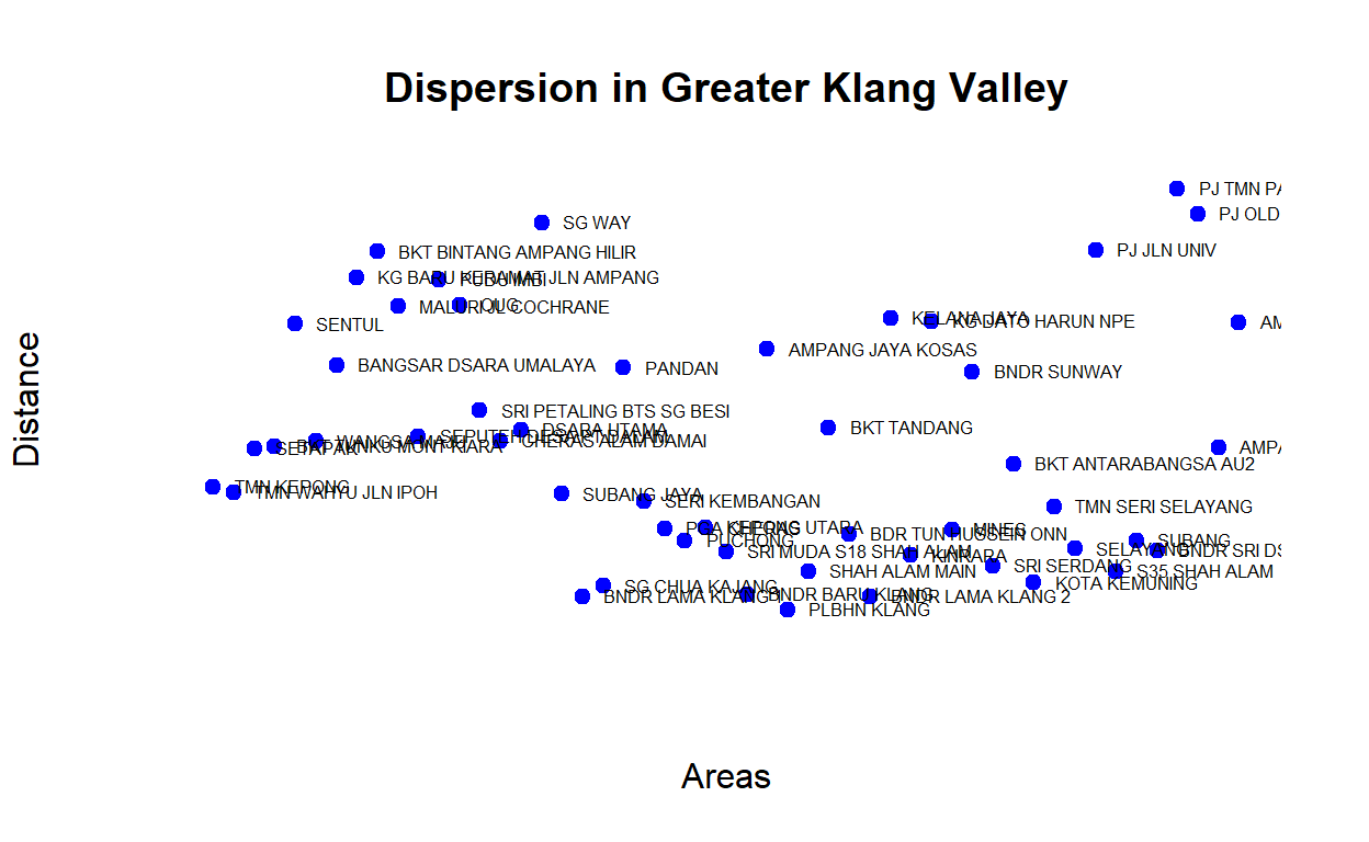
Figure 36: Dispersion measures
Note that there are areas that could be considered as hubs, such as Sg Way, areas in PJ (Jln Universiti, Old Town), as well as Bukit Bintang (KLCC) are high hub clusters. Hub is an important dimension of the network.
Origins, destinations and mobility network
Modeling "Origins and Destinations’ (OD) within a Spatial network is a fundamental problem in geography and spatial economics of the location of activities and their spatial distribution. It is a key ingredient in the studies on the epidemiology of infectious diseases, marketing and store locations, logistic distributions, and numerous other applications. The base to all of this is to develop the OD data for the spatial network under investigation.35
The process of creating OD data begins with the generation of OD matrix for all possible Origins and Destinations (in our case, 90 by 90 matrix). This process is generally extremely difficult and costly to measure. Recent technological advances such as the GPS, the democratization of mobile phones together with geosocial applications, etc. allow for precise measurements on large datasets and point to the possibility to understand quantitatively urban movements.36 However, since we couldn’t get hold of such types of data, we have to rely on performing modeling based on “known distributions and processes” done in other studies for other cities around the world. A summary of this study is provided in Barthelemy (2010)(Barthelemy 2010) and Batty (2013)(Batty 2013). The various studies have shown that the OD structures for most cities follow a certain process which could be modeled based on “time-traveled” as well as “durations traveled”, and despite various modalities of travel (i.e. by private transport, public transport, etc.) it all follows a gamma distribution (on a log-log scale) of scale ranges around 0.2 and shape ranges around 0.7.37
The full model and description are provided in Appendix C.
Greater Klang Valley OD
Based on the models developed we generate the OD data for the whole Greater Klang Valley for all possible origins to major Destinations as explained. Here we present the results of performing the OD data algorithm as described. First, we present a map view of the Origins, which consists of all original clusters in Greater Klang Valley as shown below:
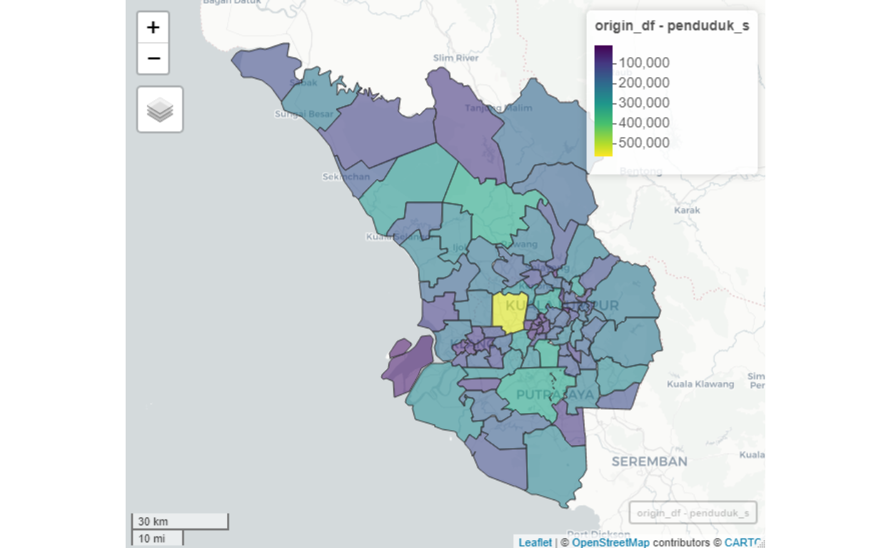
Figure 37: Origins clusters
We need to determine the “Destinations”, which in our case here, we are interested in the areas in the Greater Klang Valley as potential destinations for working purposes. A map view of the destination clusters is shown below:
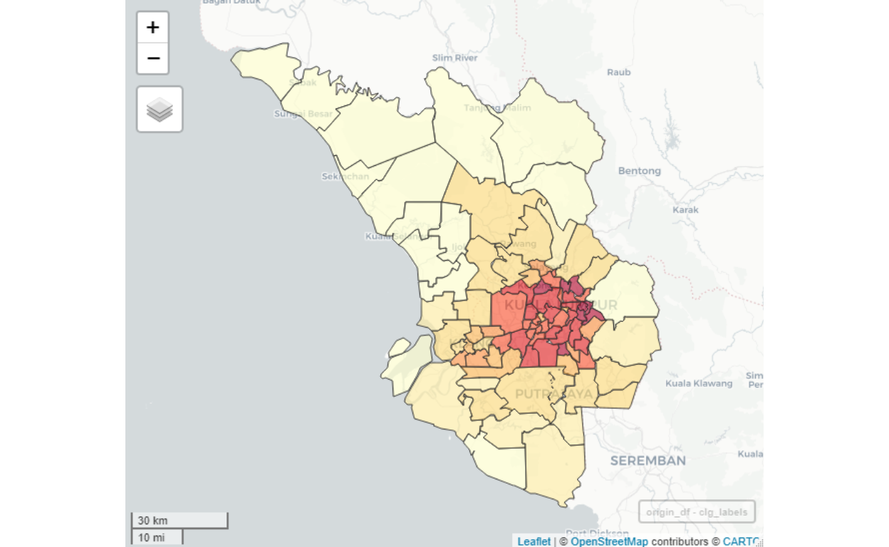
Figure 38: Destinations clusters
The map demonstrates which areas are highly likely to be “work concentrations” (colored dark red), all of them centered towards central Kuala Lumpur (except for Putrajaya/Cyberjaya). Sparse areas (some areas in Selangor such as Semenyih) is highly likely to be the source of “Origins” instead of as a “Destination” for work related mobility.
Within Greater Klang Valley itself, we could further sub-classify the Origins and Destinations as follows:
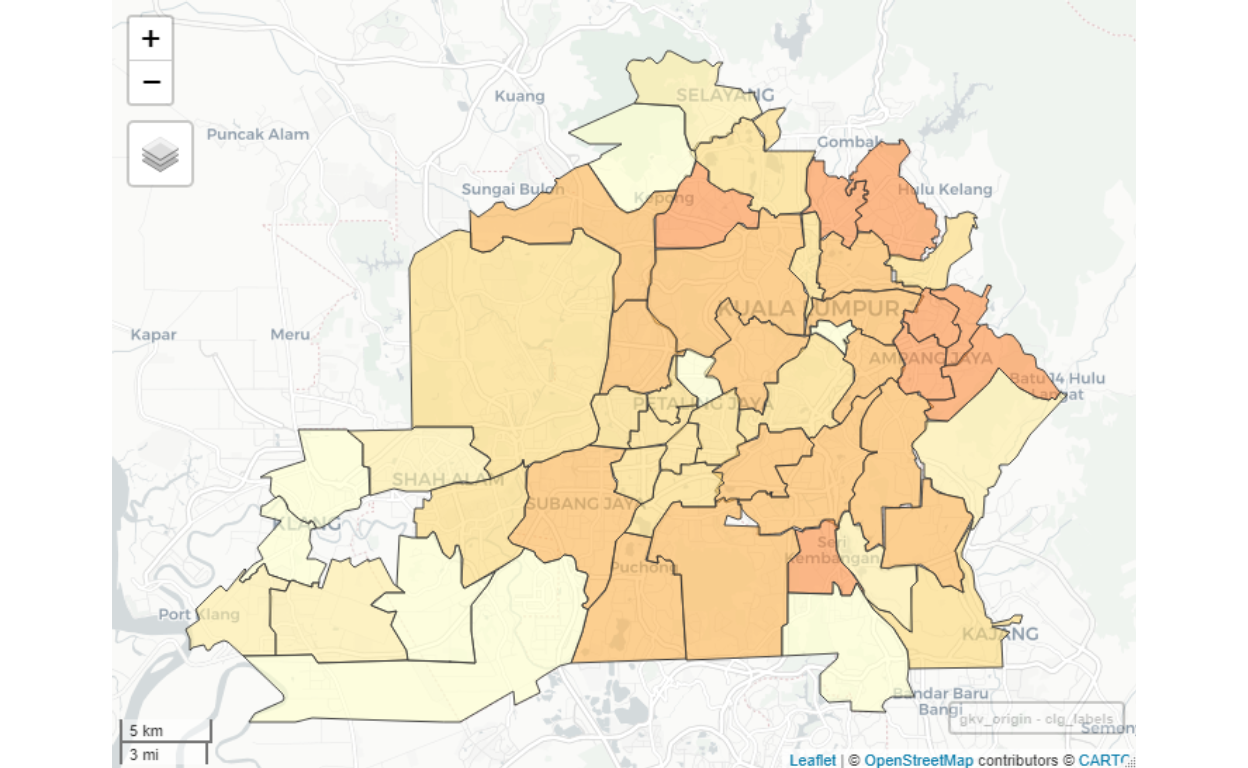
Figure 39: Origins clusters for GKV
The complete analysis for all possible Destinations for Greater Klang Valley is available in the form of Smart City Analytics Dashboard application.38
KLCC as Destination sample results
As a sample of the analysis, here we provide the case for KLCC/Bukit Bintang as a demonstration:
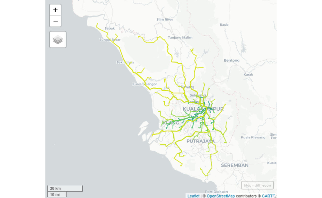
Figure 40: Flows to KLCC from all possible origins
If we eliminate travels which are of “long distance” for work39, then we will end up with a much more realistic “flows” of people going to work in KLCC/Bukit Bintang area as shown below:
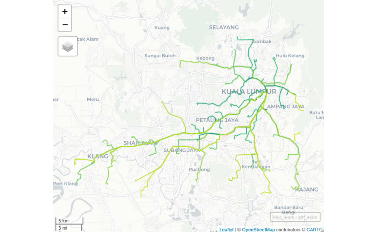
Figure 41: Flows to KLCC from all GKV origins - within reasonable distance
Note that lighter colored paths (roads) imply a lesser number of people coming from the Origins (other areas in GKV and Selangor) to the Destination (KLCC/Bukit Bintang). The roads (links) shown may not be the actual roads taken, as it only indicates the direction of flows. The actual traffic itself is another subject that we do not yet cover in our analysis since our objective is to understand the flows of people from an Origin to a Destination.
As an indication, we can see that for example, to enter KLCC area, DUKE is an important link if you are from areas north of KL, Federal Highway if you are from PJ, and Jalan E37 (from Sungai Besi Toll to KL) if you are from the South. Furthermore, the intensity of the flows is higher from certain locations, even though in terms of distance it is a bit longer, as compared to other areas. As an example, Kinrara has higher flows to KLCC, compared to Bt14 Hulu Langat to KLCC, even though by kilometers Hulu Langat is closer. The reason for this is due to a higher density of population in Kinrara, compared to Hulu Langat.
Now we provide sample reports for the results after running the algorithms. Below we provide a map view sample for KLCC as the Destination:
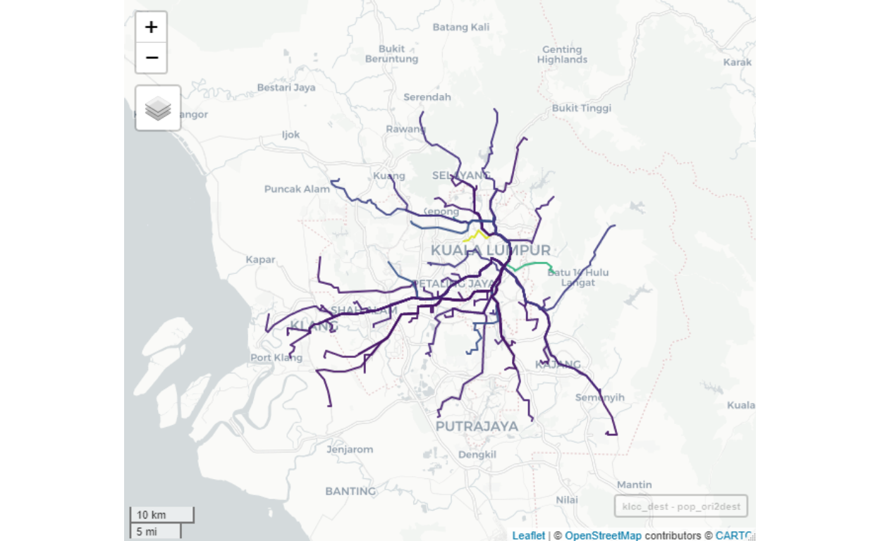
Figure 42: Flows to KLCC by volume
To see the details of mobility from various Origins to KLCC Destination, here we provide a tabular results as a sample:
| Origin | People | Origin | People | Origin | People | |||
|---|---|---|---|---|---|---|---|---|
| TMN KEPONG | 10614 | PUCHONG | 2268 | RAWANG | 3453 | |||
| TMN WAHYU JLN IPOH | 7369 | KEPONG UTARA | 1459 | HULU KLANG | 2047 | |||
| BKT TUNKU MONT KIARA | 30233 | PLBHN UTARA KLANG | 1377 | TMN SERI SELAYANG | 442 | |||
| OUG | 1087 | SRI MUDA S18 SHAH ALAM | 1464 | SELAYANG | 1140 | |||
| SRI PETALING BTS SG BESI | 3594 | BNDR BARU KLANG | 760 | PJ JLN UNIV | 2070 | |||
| CHERAS ALAM DAMAI | 660 | PLBHN KLANG | 1171 | S35 SHAH ALAM | 210 | |||
| GOMBAK UIA | 1038 | SHAH ALAM MAIN | 1329 | PDG JAWA KLANG | 664 | |||
| DSARA UTAMA | 4268 | BKT TANDANG | 851 | SUBANG | 7114 | |||
| SG WAY | 649 | BDR TUN HUSSEIN ONN | 1007 | BNDR TASIK PUTERI | 5177 | |||
| SUBANG JAYA | 224 | BNDR LAMA KLANG 2 | 568 | KUANG | 3279 | |||
| BNDR LAMA KLANG 1 | 869 | KELANA JAYA | 1582 | BNDR SRI DSARA | 7461 | |||
| BANGI | 1552 | PUTRAJAYA CYBERJAYA | 1375 | PJ TMN PARAMOUNT | 2231 | |||
| SG CHUA KAJANG | 682 | KINRARA | 6341 | PJ OLD TOWN | 200 | |||
| ECO MAJESTIC | 471 | KG DATO HARUN NPE | 616 | HULU LANGAT BT14 | 4786 | |||
| SEMENYIH | 2001 | MINES | 579 | AMPANG CAMPURAN | 20138 | |||
| SERI KEMBANGAN | 1308 | BNDR SUNWAY | 326 | TEMPLER PARK | 3320 | |||
| PGA CHERAS | 2106 | SRI SERDANG | 395 | TLK GADONG KLANG | 636 | |||
| MERU | 743 | KOTA KEMUNING | 278 | SIJANGKANG | 239 |
We can see that for example, there are a total of 157,821 people coming from various destinations to KLCC area, and largely the largest contributors are from Mont Kiara/Bukit Tunku area and from Bandar Baru Ampang area.
Petaling Jaya as Destination sample results
For purpose of comparisons, let us study the results of another area, “PJ JLN UNIV” (PJ Jalan Universiti).
| Origin | People | Origin | People | Origin | People | |||
|---|---|---|---|---|---|---|---|---|
| TMN KEPONG | 12317 | PANDAN | 1793 | MINES | 1922 | |||
| TMN WAHYU JLN IPOH | 5025 | SERI KEMBANGAN | 4293 | SRI SERDANG | 3036 | |||
| SETAPAK | 897 | PGA CHERAS | 555 | BKT ANTARABANGSA AU2 | 2746 | |||
| SENTUL | 204 | MERU | 5484 | RAWANG | 11422 | |||
| WANGSA MAJU | 722 | PUCHONG | 1339 | KAPAR | 1089 | |||
| KG BARU KERAMAT JLN AMPANG | 853 | KEPONG UTARA | 7360 | HULU KLANG | 2632 | |||
| BKT BINTANG AMPANG HILIR | 939 | PLBHN UTARA KLANG | 8069 | TMN SERI SELAYANG | 7 | |||
| MALURI JL COCHRANE | 1854 | SRI MUDA S18 SHAH ALAM | 412 | SELAYANG | 4389 | |||
| SEPUTEH DESA PT DALAM | 1012 | BNDR BARU KLANG | 1271 | S35 SHAH ALAM | 80 | |||
| PUDU IMBI | 25 | AMPANG JAYA KOSAS | 4931 | PDG JAWA KLANG | 329 | |||
| SRI PETALING BTS SG BESI | 11735 | PLBHN KLANG | 129 | SUBANG | 19733 | |||
| CHERAS ALAM DAMAI | 345 | SHAH ALAM MAIN | 128 | BNDR TASIK PUTERI | 7280 | |||
| GOMBAK UIA | 2416 | JENJAROM | 3269 | KUANG | 5253 | |||
| BNDR LAMA KLANG 1 | 107 | BKT TANDANG | 6327 | BNDR SRI DSARA | 4521 | |||
| BANGI | 5529 | BDR TUN HUSSEIN ONN | 671 | HULU LANGAT BT14 | 915 | |||
| SG CHUA KAJANG | 1086 | BNDR LAMA KLANG 2 | 906 | AMPANG CAMPURAN | 5730 | |||
| ECO MAJESTIC | 1524 | PUTRAJAYA CYBERJAYA | 1826 | AMPANG POINT PUTRA | 1765 | |||
| SEMENYIH | 1526 | KINRARA | 6211 | TLK GADONG KLANG | 128 |
The largest number of people are coming from Subang/Kota Damansara area, Seri Petaling Sungai Besi, and from the Northern Corridor (represented by Rawang).
General remarks
Note that there are still several rough edges in the results. This is mainly due to applying a universal power law that we used throughout the model. This power-law parameters, in a dynamic condition (intertemporal as well as interlocations), could be adjusted by obtaining them from actual OD data, once they are available. This is the “learning elements” which we will perform overtime when the data do come available. For now, we will rely on this static model to provide a general guide to the whole OD process.40
Furthermore, as more granular data becomes available (such as GPS or user input location data), we will create dynamic updates of the model in real-time, which allows greater dynamics of the process, to allow analysis in the near real-time process. Furthermore, if we have other sources of data such as inter-modality transportation data, public or mass transport data, as well as traffic management data, the based OD model could be further updated through “AI machine learning” process, which will be the dynamic layers on top and above of the static OD model developed here. This will increase the level of “smartness” of the OD analytical process.
Localized networks
Now we turn to the next level of analysis, namely generating the “local network” within each major cluster groupings developed in the earlier sections. By the local network here we mean the “networks” of smaller clusters within each cluster area (i.e. within each of the 90 cluster areas defined earlier). This exercise is important in the sense that we can’t assume each localized network is the same across the board. As an example, we know by casual observation that the KLCC area is not structurally the same as the Putrajaya area. Therefore, there is a need to further developed a much granular level network analysis. How we perform this exercise and provide some sample results is the purpose of this section.
The task here is similar to the task described earlier for the larger areas, which is to generate “contiguous” neighborhoods based on some characteristics of these neighborhoods. Examples of characters/features are “highly residential areas” versus “office areas”, as well as many other characters/features - which include the land cover such as water bodies, buildings by types, road by types, and so on. The contiguities of these characters/features would then define each sub-areas.
Given that the data available for each area are not perfectly complete as well as the categorizations involved are either inaccurate or incomplete - this task is a very challenging process. The level of complete automation is no longer possible since the incomplete data (represented as Not Available or “NA”) could potentially introduce biases or errors in the automata process. For this reason, what we have performed is to run the algorithms for each area, for each of the 90 areas involved.
Furthermore, we have to note here that as we run the algorithms for each area, the immediately (next neighboring areas) must be included in the process to allow the analysis on the “edges” of the areas to be non-biased. Logically this is important since the real physical boundaries between areas are not as straightforward as it involves common spaces and features (such as roads, rivers, and other boundary markers). These boundaries themselves are rather contiguous.
The decomposition at a localized level is an extremely important step in creating the “intelligence” over these localized clusters networks.
Data source and layers
The first step for generating localized clusters is to generate spatial data for the locality. Here we relied on data from OpenStreetMap as our data source. What we do is to create data as layers, and from OpenStreetMap, we will use the layers for the road and rail networks, buildings, and land use. The data is incomplete and labeling is also incomplete (lots of “NA”). Since the purpose of our task here is a proof of concept, we will, for now, rely on this data.41
There are three layers utilized namely: road networks, rail networks, buildings, and land use. Sample map views of these layers are shown below for the case of Putrajaya. A similar process is performed for each other areas in Greater Klang Valley. For demonstration, we will go through the step-by-step process for Putrajaya and Cyberjaya.
For this paper, we provide a sample report for Putrajaya and its vicinity (which includes Cyberjaya, Sepang, a bit of Puchong and Banting). The full report for the analysis is available as Dashboard for Putrajaya.42
The area coverage for Putrajaya and Cyberjaya is shown below:
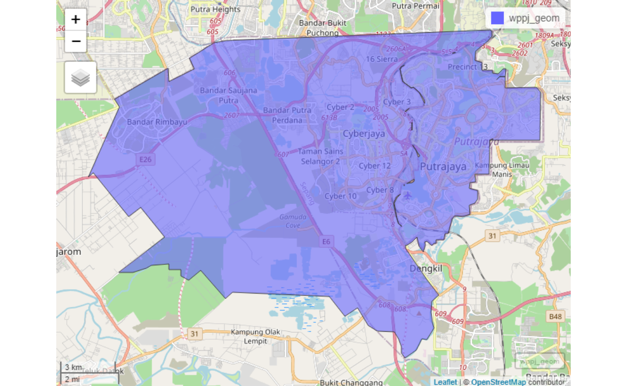
Figure 43: Cluster map for Putrajaya/Cyberjaya
The road networks within Putrajaya and Cyberjaya is shown below:
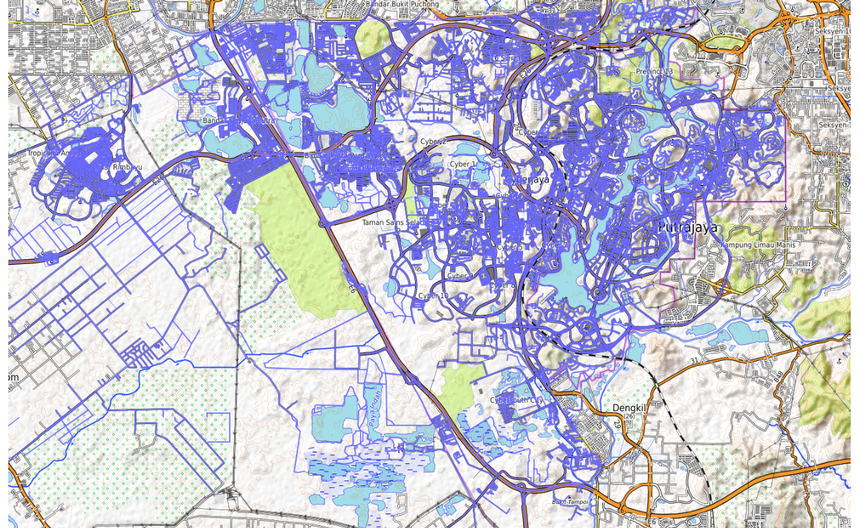
Figure 44: Putrajaya/Cyberjaya road networks
And for the buildings:
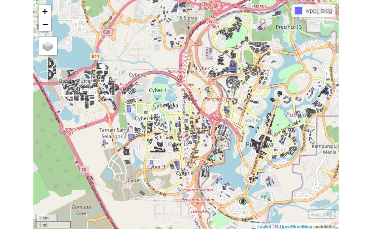
Figure 45: Putrajaya/Cyberjaya buildings
And for the land use:
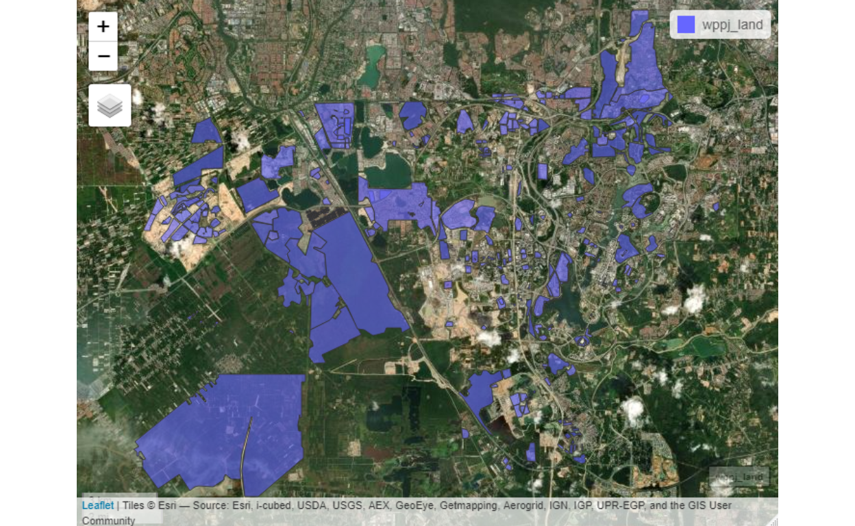
Figure 46: Putrajaya/Cyberjaya land use
From these layers we create the clusters of neighbourhoods for Putrajaya/Cyberjaya. There are few types of clusters to be generated, Type I is where the residential neighbourhoods are identified and created. Here we provide various Snapshots from Putrajaya Smart City Analytics dashboard for demonstration.
The residential clusters, there are alltogether 147 sub-clusters for the area as shown below :
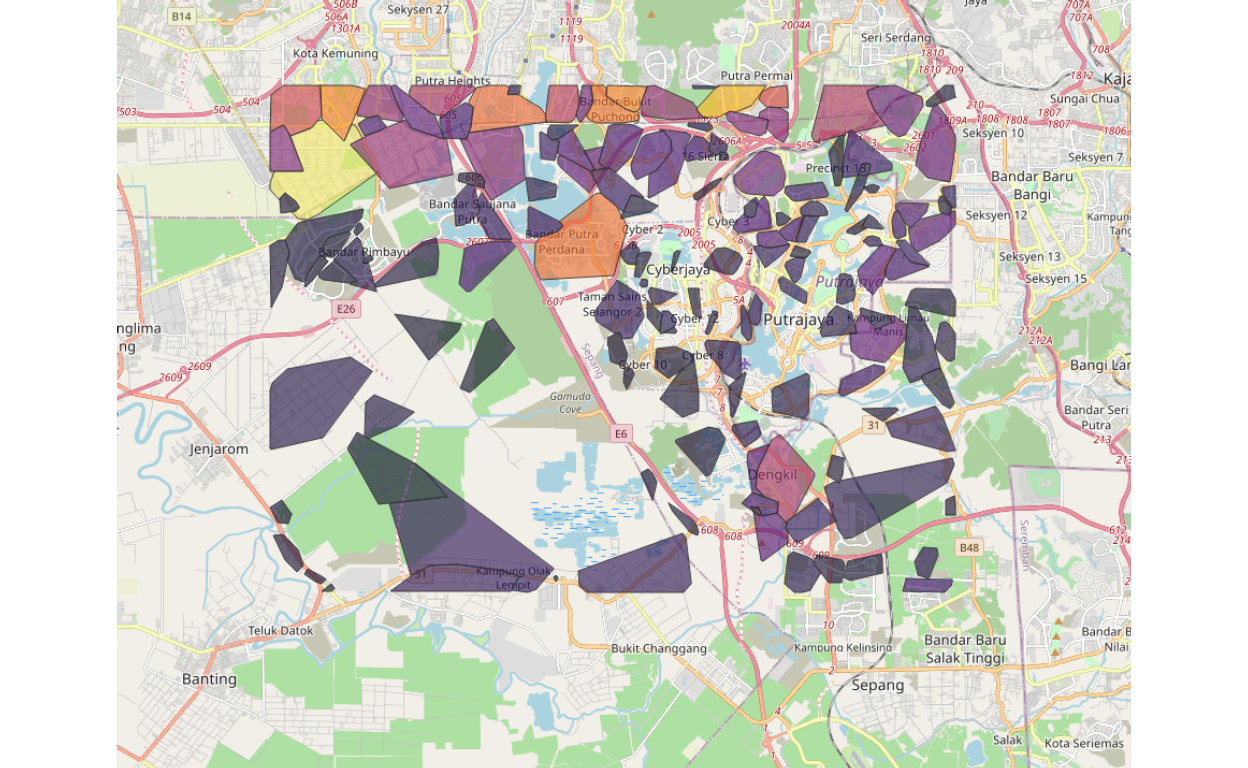
Figure 47: Putrajaya/Cyberjaya residential clusters
Note that our algorithms used managed to identify clusters for Putrajaya/Cyberjaya by its contiguities, rather than by the definitions of Precincts based on city zoning and planning. Contiguity based clustering is a better way because, as an example, two areas may be under different precincts may be closer to another area in the next precinct since they are “more connected” to this other area compared to an area within the same precinct. Furthermore, within a precinct, we could see that it may contain other sub-areas, which at a granular level have more similarities to each other. The ability to capture such granular effects is very important for subsequent analysis to be performed.
There are 80 sub-clusters for the work areas as shown below:
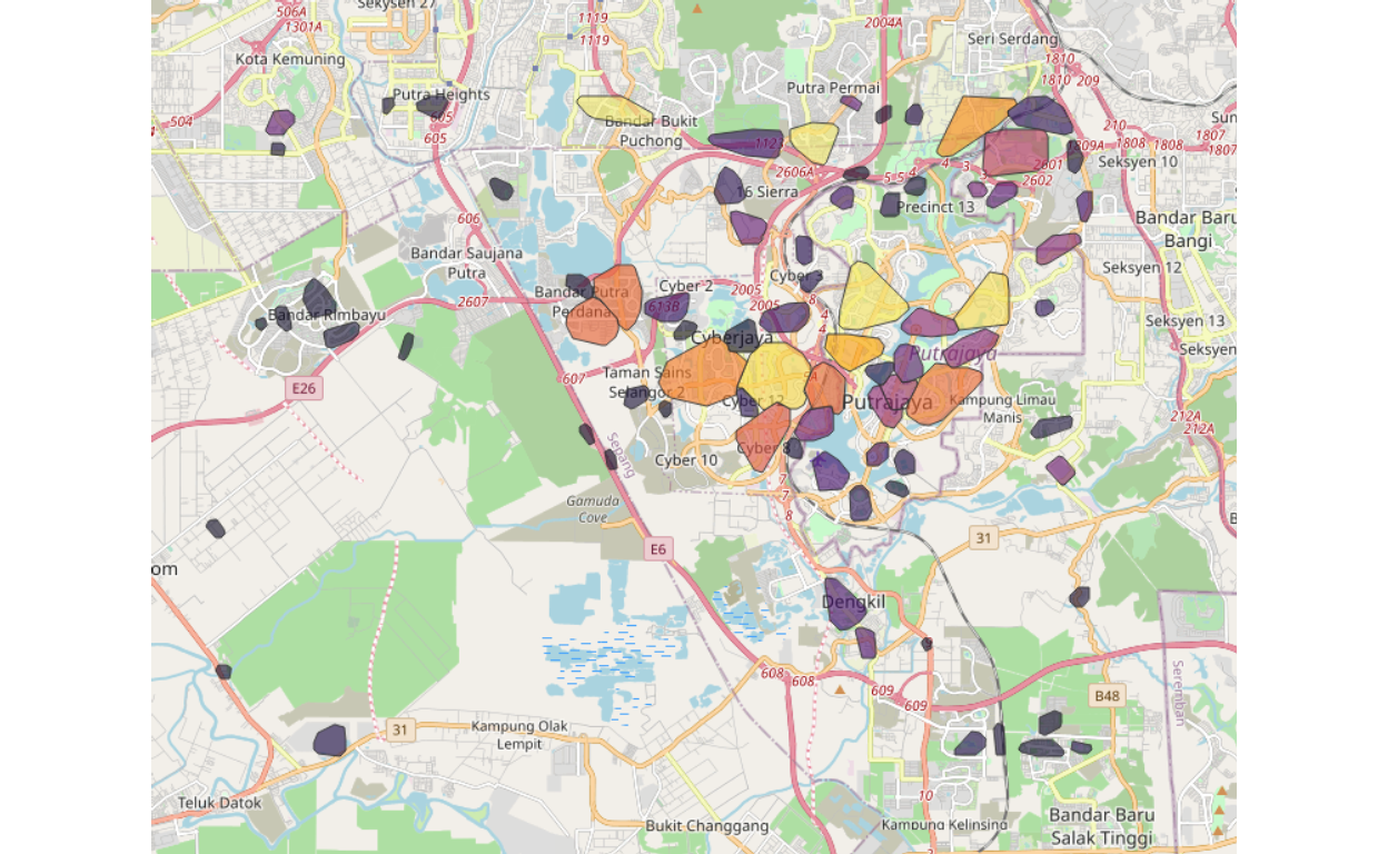
Figure 48: Putrajaya/Cyberjaya work clusters
Furthermore, as can be seen, we manage to segregate or differentiate areas that are working clusters. Note that in the case of Putrajaya/Cyberjaya, the mix between residential areas and work areas and the demarcations are at times rather ambiguous.
Once we have developed the clusters, now we could perform various analytics based on these groupings. An example is a cluster that is “networked” or “connected by roads” to the surrounding clusters. A snapshot is shown here for the case of “clg57”, which is located in central Putrajaya and how they are linked to other clusters within 15 minutes driving distance.
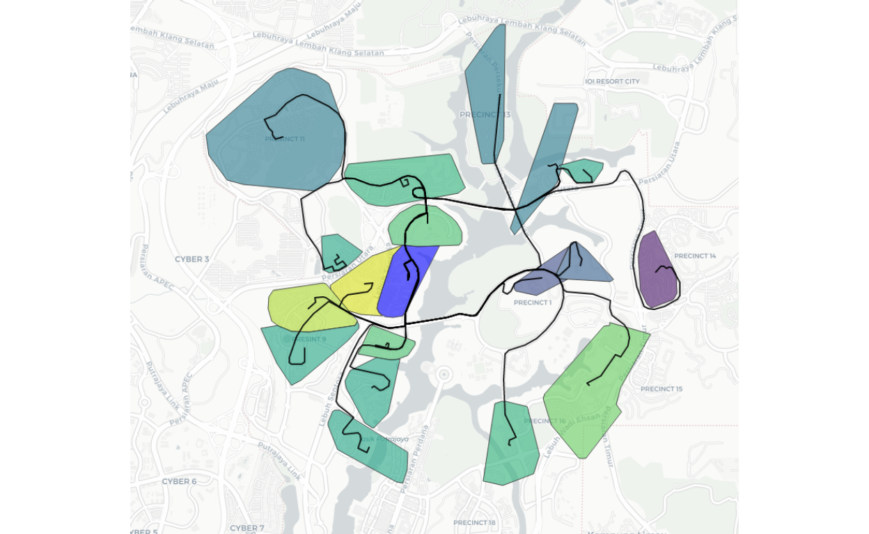
Figure 49: Cluster 57 road links to nearby residential clusters
The same process is performed for all 90 clusters for GKV, WPPJ, and Selangor state.
Points of Interest (POI) analysis
Now we could go one more step further in our analysis by going after all possible Points of Interest (POI) or Points of Importance. The data that we use here is obtained by scraping from various sources of publicly available data. As the base, we use data scraped from OpenStreetMap, we also scraped data from FourSquare, and we use our data collected by Techna Analytics Sdn. Bhd.43
The parameters for each POI is defined in the Appendix, which consists of all possible categories required to determine the types, usage, and various other determinations. The data still has a lot of Not Available features, for example, we do not have any data on say the “height of a building”, the total size of each floor areas, and the usage (i.e. commercial or office or residential). Similarly, there are many “points” based data, which contains only the geo-locations without further definitions of its linkages and attributes (such as traffic light at a junction).
A sample snapshot for “clg57” (residential clusters), and the positions of all retail outlets within the vicinity is shown below:
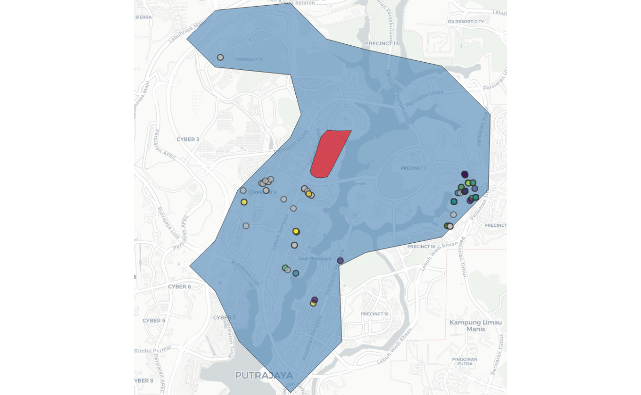
Figure 50: Retail POIs nearby residential Cluster 57
Cluster 57 is colored “red” and the surrounding retail outlets within 15 minutes driving time from the cluster are shown as small dots. And if we expand further one of the dots, we can see the details/particulars of the POI concerned. In our sample here we choose a Seven-Eleven outlet as an example as shown below:
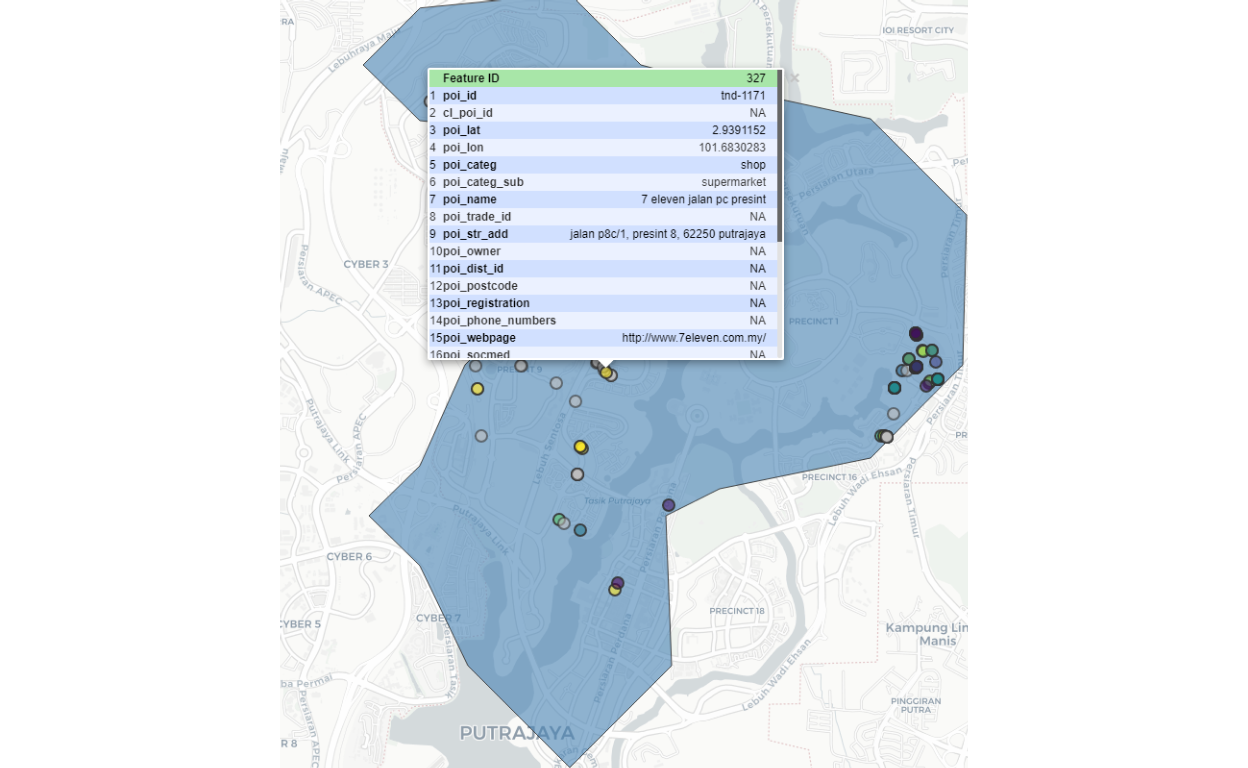
Figure 51: Seven Eleven nearby residential Cluster 57
Spatial analytics
Now we are ready to proceed to the next level of analysis, and this will be based on various use cases and requirements. Generally, there are two types of problems to be solved - namely “diffusion” problems or “attractions” problems. Diffusion is a case where the interest is to predict how objects (which can be anything, such as a virus in the case of Covid-19, or events, such as people going out from their homes or local areas to outside areas) spread out from its origin(s) to other areas. On the other hand, in the case of attraction, the object is static (which can be anything, such as a mall, a shop, a gathering, an event) and the interest is to see how other objects (such as people) from the same area or from outside are attracted to the object concern. The basic modeling is what we termed as either a “diffusion model” or “gravity model” respectively for the two cases. In some cases, we might have both elements co-exist at the same time for the same object(s).
As described by specialists of spatial analytics, there are six categories of analysis involved:44
- Understanding where
- Measuring size, shape, and distribution
- Determining how places are related
- Finding the best locations and paths
- Detecting and quantifying patterns
- Making predictions and decision making
Depending on the requirements and data availability, we could process and perform these analytics using any approach, whether a top-down approach or bottom-up approach, as well as to deal at a localized level or globalized level and mixture of any of them. The dimensionality of the analytics depends on the problem statements of the analyzer.
The most important part is what we have completed is to develop the algorithms to create the base network, which is the base layer to be used in any of the analytical requirements and for any data capture processes to be deployed.
For the demonstration, we will select a few use cases which we will deal with next.
Use case 1: Human density at a POI
The purpose of the analysis is to generate an estimated count of “visits per day” from the local community to a specific class of POI of choice. In this case, we choose retail outlets related to Residential Cluster 57. A snapshot picture is shown below:
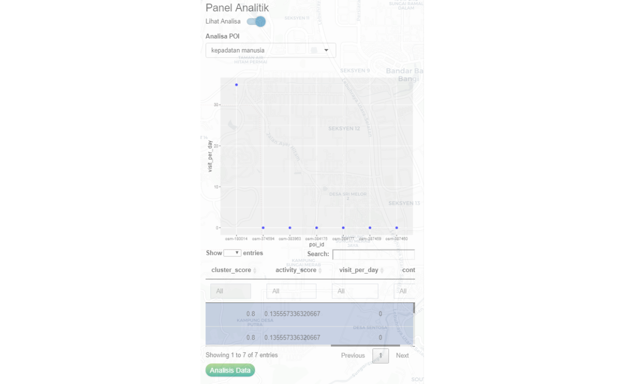
Figure 52: POI analytical scoring for human density for Retail POIs
What the analysis provides is various measures of scoring, such as the density of people to the specific POI. The collection of POIs within a cluster (LOI) is analyzed within the context of the total network and the local network to determine various measures to be applied. An example is as follows: a coffee shop within a very busy area will have the likelihood of having more customers, during lunchtime. The number of customers within walking distance of (say 500 meters) will be estimated, and based on the space available, the density of people during such time would be 3 people/meter square of space. The accuracy of the estimation first is made by the network model, then will be updated through the “learning process” when real-time data becomes available.
Use case 2: Determining the risk of Covid-19 disease spread within the “localized community”
The known model to predict Covid-19 is called the SIR Model (and any of its variations). In this model, the basic assumption is to generate a disease “diffusion process” where an infected person came into contact with the susceptible person and spread the disease. Depending on the objective of the problem statement, we can use the base layers data that we have generated to determine the predictions to be made.
As an example, we can simulate a situation where an incidence occurs in an area. The question is how would this incidence spread in the community, and if there are measures taken such as isolation procedures or lockdown of areas, how would the results be. Furthermore, this process can be done at a localized level or to be extended to a larger level (localized versus globalized), and what type of controls and procedures to be implemented. The effectiveness of any interventions is measurable and benchmarked against other procedures.
In our case here we will use the data feed from the various clusters created, and feed them into the SIR model, where each cluster will be treated separately using its parameters as the feed into the localized SIR model. This localized SIR model then will be combined with the results of SIR models run concurrently for all the chosen set of clusters to generate larger community-wide predictions. Since localized conditions are controlled, the modeler could now evaluate the performance of the interventions at each localized environment and study its impact on the globalized environment.
In short, what we have now is not only a localized and globalized prediction, but we also have dynamic elements to be introduced. The only caveat we must state here is that to interpret the results would require expertise in epidemiology and healthcare specialists.
Use case 3: Human distancing management and control
In the case of human distancing management, we will create the networks linking the various POIs and clusters, and smartly compute the scores and indexations. Based on these scoring we could predict the locations, or areas or POIs which requires higher attention as far as practicing social distancing are concerned.
Here, the local authorities could set its own rules of permissible activities, based on “localized rules”, such as “no more than 20 people at a time” in a POI. Furthermore, it could also provide guides to which POIs should be promoted more, by providing proper measures based on “essentialities” compared to less essential activities.
Furthermore, metrics can be generated for activities that have higher human contacts versus the ones with lower contact activities, which then allows the density of people at a single time at any location.
Use case 3: Creating “food-hailing riders” community
Creating a food-hailing rider for a community is an interesting challenge. However, based on the analytics we have created, this is easily performed once the key parameters are defined. For example, we can calculate the potential usage for a given “food-outlet provider” and calculate the market potentials for such products given a coverage area of let say within 30 minutes driving distance to the location. Based on that, we could also determine what would be the cost of delivering such products to the end consumers within the defined area.
If we can further determine the potential number of people who could provide the ridership service within the specific community concerned, then we could estimate the “arrival” of these services to serve the outlet as well as the community concern. Furthermore, if these exercises can be created as a mobile App, the analytics workhorse as explained will be the intelligent engine to suggest and promotes both the providers, e-riders, and users. The process could easily beat other players by generically create the solution which is tailored to the localized players - on all three fronts - providers, e-riders, and users. Furthermore, if properly created, the App should and could focus on the importance of localized players as opposed to players from outside the community.
Use case 4: Disaster Response Management
Disaster response management is a very wide subject by itself. Here we focus specifically on the reach of the community to the healthcare facilities within the area of concern. Key questions would be the distance, and accessibility (assuming free and open access), and let’s say if testing is to be done, the number of people to be tested. This can be further broken down by localized clinics or health centers.
If the data and requirements of a disaster response requirements are available, the analysis could be broken down to more granular details - such as number of doctors versus patients, hospital beds, ICU units, number of equipment (such as ventilators in the case of Covid-19), ambulances, etc.
Similarly the same can be said for the case of public safety - for managing events (such as public protests), traffic management during storms and floods, firefighters, and crime prevention.
Conclusion
We would conclude our paper by stating a few pointers:
- The process of generating a “smart city data algorithm” is an important element for “smart city” programs; and we have provided the basis of the algorithm, which is performed as an open and transparent process.
- The base algorithms will be further enhanced as we go along with the learning process as more data and real-time data becomes available - which will increase the “smartness” of the data through “learning”. Our base algorithm is designed for this process.
- The development of use cases is a very wide and open subject, which will be our focus in our quest for the “Smart City” solutions that we are undertaking.
- To our knowledge, our attempt here is the first serious attempt to undertake what we do, for the case of Malaysia. And being the first, we admit many potential shortcomings, to which we could only improve upon by constructive criticism and inputs from others.
At the minimum, we are now ready to use our algorithms to deploy various use cases as they are required by the various players such as the local council/authorities, state governments, and even business enterprises demanded.
Techna Analytics Sdn. Bhd. (A member of Techna-X)
Apendix A : Network definitions and notations
Networks are defined by the Nodes which could be the POIs (Point of Interest or Importance), LOIs (Location of Interest or Importance), Edges (which is defined by the relationships between POIs and LOIs), and the Agents (which defines the attributes of the Nodes and the Edges).
The notations and definitions are provided below:
Point of Interest (POI) is defined as \(P^{i}\) where \(i \in POI = \{1,2,3,....,N \}\) all POI within the domain of interest.
\(P^{i}\) is represented with a set of Spatial Polygons with all identifiers and attributes, and represented as follows: \[P^{i} = \{\bar{x}_i,\bar{y}_i,\bar{z}_i\}\] where \(\bar{x}\), \(\bar{y}\) and \(\bar{z}\) are the geometries and attributes of the Polygons (such as name, address, etc.)
Location of Interest (LOI) is defined as \(L^{l}\) where \(l \in LOI = \{1,2,3,...,M \}\) all LOI within the domain of interest.
\(L^{l}\) is represented with a set of Spatial Polygons with all identifiers and attributes, and represented as follows: \[L^{l} = \{\bar{x}_l,\bar{y}_l,\bar{z}_l\}\] where \(\bar{x}\), \(\bar{y}\) and \(\bar{z}\) are the geometries and attributes of the Polygons (such as idenitifiers, classes, etc.)
Local network (or sub-network) is defined as the set of \(P^i|LOI=l\) where Polygons of \(P^i\) in the Polygon of \(L^l\). The network will be defined as set of vertex or nodes \(V^{POI|LOI}\) and it’s links or edges \(E^{POI|LOI}\). The set of a local network is defined as \[N^{POI|LOI} = \langle V^{POI|LOI},E^{POI|LOI} \rangle\]
The Greater network is just a set of all local networks, \[N^{LOI} = \langle N^{POI|LOI=1}, N^{POI|LOI=2}, \dots, N^{POI|LOI=M} \rangle\]
Finally, the people, other objects (such as business entities, shops), events which are linked to any POI or LOI, are defined as agents or collective set of agents operating within the networks.
Appendix B: Points of Interest (POI) parameters
A POI is further defined as follows:
- Identification of the POI (poi_id)
- Cluster’s identification for the POI (cl_poi_id)
- Geometric location of the POI (poi_geom)
- Categories of the POI (poi_categ)
- Sub-categories of the POI (poi_categ_sub) - if available
- Name of the place (poi_name) - if available
- Name of trademark (poi_trade_id) - if available
- Street address of the POI (poi_str_add)
- Name of the owner (poi_owner) - if available
- District of the POI (poi_dist_id)
- Postal code of the POI (poi_postcode)
- Business registration of the POI (poi_registration) - if available
- Telephone numbers (poi_phone_numbers) - if available
- Web address (poi_webpage) - if available
- Social media (poi_socmed) - if available
- Wifi (poi_radio) - if available
- Opening hours (open_hours) - if available
- The area in square meters or foot (poi_area) - estimated
- Customer size (poi_cust_size), expected number of seating - estimated
- Tags (poi_tags) This various tagging that will be added later
- Historical data of visits (not available yet)
Apendix C : Formalized Origins-Desitnation (OD) Model
Following similar methods as proposed by Barthelemy (2010)(Barthelemy 2010) and Batty (2013)(Batty 2013), two main parameters will be applied in generating the distributions of people from “Origins” to “Destinations”, namely: the distance (or we could also choose duration) of travels, and the gravity of travel. This is formalized in the definitions below.
For any given Destination, \(d \in D\), there are possible \(o_d \in O\) given a choice of \(d\). There are various attributes between \(O \mapsto D\) which is a martix of OD attributes, \(A\) where \(A|od = (a_{od1},a_{od2},...a_{odn})\ \ \forall \ o \ and \ d\).
For a set of Population from an Origin, the number of people “flowed”(moved) to the Destination would then be captured by: \[P_{o|d} = P*f(A|od)\] where \(f(A|od)\) is a function to be defined. In totality the resulting Population matrix with any destination would be defined by: \[P^{od \ matrix} = P_{o|d}*f(A_{o|d})\]
Define \(f()\), the OD function that we will apply, namely the “distance function” and the “gravity function”.
Inverse-square law of distance
Most of the travels (to work or leisure) follow a probability distribution which of “inverse square law of distance”. This is summarized in the form of: \[\frac{intensity_o}{intensity_d} = \frac{distance^2_o}{distance^2_d}\]. This will provide us an “origin-destination” constraints function, by penalizing “longer distance” more than the shorter distance by a large penalty (squared). Note that the “distance” used can be in the form of road distance or time duration to travel on the road. In the case of walking, the same rule could also be applied, by applying duration instead of physical distance (for example, due to terrains involved in walking - uphill is not the same as downhill).
The probability of a person moving from an Origin to a Destination, would then be \[p_{o|d} = K_{od}*c^{-\alpha}\] where \(K_{o|d}\) is a constant and \(\alpha\) is the exponent. The probability would then follows a Power Law distribution, in which case, as documented by Batty (2013)(Batty 2013), would approximately equal to 2 (i.e. \(\alpha = 2\)), which is the inverse square law as described. Therefore, the scaling parameter used is \(2\).45
Note that depending on the attributes of any \(o\) and \(d\), the relationship is not necessarily asymmetric, and in fact could have high asymmetricities.
Gravity
The second application that we will use is what is called as “gravity model”, which is states that an area with “higher economic” activities (such as GDP measures), would attract higher people as compared (relatively) to an area which has “lower economic” activities. Furthermore, it is always the case that the percentage of people from an area to move out to work in other areas would depend on economic activities available within the vicinities are more preferred than areas that are outside of the vicinities. Taken in combination, this is considered as “internal gravity pull” versus “external gravity push”. These relative terms would then determine the percentage of people moving out versus staying in the Origin area.
In our case, we have created an “econ” variable to capture these measures, and to properly normalize it, we have transformed this measure using a Power Law of exponent 2, to ensure proper weightage on extreme observations (both on the lower extreme and upper extreme). Therefore, in our case here the function to apply would be: \[gravity_{od} = \frac{econ_o}{econ_d}\]
- Full OD formula
Summarizing everything, our OD formula then would be:\[f(population) = K_{od}*c^{-2}*gravity_{od}\] wher \(K_{od}\) is the ratio of population between the Origin and the Destination \(\frac{P_o}{P_d}\).
Barabasi, Albert Laszlo. 2016. Network Science. Cambridge, United Kingdom: Cambridge University Press.
Barthelemy, Marc. 2010. “Spatial Networks,” March.
Batty, Michael. 2013. The New Science of Cities. Cambridge, Massachussets, USA: The MIT Press.
———. 2018. Inventing Future Cities. Cambridge, Massachussets, USA: The MIT Press.
Batty, Michael, and Paul Longley. 1994. Fractal Cities : A Gemoetry of Form and Function. New York, New York, USA: Academic Press.
Bivand, Roger S. 2019. “Creating Neighbours.” The R Journal, September.
Bootle, Roger. 2018. The Ai Economy : Work, Wealth and Welfare in the Robot Age. New York, USA: Nicholas Brealey Publishing.
Domingos, Pedro. 2015. The Master Algorithm : How the Quest for the Ultimate Learning Machine Will Remake Our World. New York, USA: Penguin Books.
Elsa Arcaute, Erez Hatna, Carlos Molinero, and Michael Batty. 2016. “Cities and Regions in Britain Through Hierarchical Percolation.” Royal Society Open Science, March. https://royalsocietypublishing.org/doi/10.1098/rsos.150691.
Foster, Kirk A., and J. Aaron Hipp. 2011. “Defining Neighborhood Boundaries for Social Measurement.” Social Work Research 35 (March).
Glaeser, Edward. 2011. Triumph of the City : How Our Greatest Invention Makes Us Richer, Smarter, Greener, Healthier, and Happier. New York, USA: Penguin Books.
Hasni, Wan M. 2020a. “COVID-19 Afterworld: An Approximation of Ground Truth.” Techna Analytics Sdn Bhd.
———. 2020b. “Smart Applications for Locations-Contacts Tracking.” Techna Analytics Sdn Bhd.
Jackson, Mathew O. 2008. Social and Economic Networks. Princeton, New Jersey, USA: Princeton University Press.
M. Batty, G. Fosca, K. Axhausen. 2019. “Smart Cities of the Future.” The European Physical Journal Special Topics 214 (March): 481–518.
Miller, John H. 2015. A Crude Look at the Whole - the Science of Complex Systems in Business, Life and Society. New York, New York, USA: Basic Books.
Miller, John H., and Scott E. Page. 2007. Complex Adaptive Systems - an Introduction to Computational Models of Social Life. Princeton, New Jersey, USA: Princeton University Press.
Newman, Mark. 2010. Networks: An Introduction. Oxford, United Kingdom: Oxford University Press.
Robin, Robin Lovelace, and Morgane Dumont. 2016. Spatial Microsimulation with R. CRC Press. http://robinlovelace.net/spatial-microsim-book/.
Robin Lovelace, Jannes Muenchow, Jakub Nowosad. 2019. Geocomputation with R. CRC Press. https://geocompr.robinlovelace.net/.
Roger S. Bivand, Virgilio Gomez-Rubio, Edzer J. Pedesma. 2008. Applied Spatial Data Analysis with R. New York, USA: Springer.
Sumpter, David. 2018. Outnumbered : From Facebook and Google to Fake News and Filter-Bubbles, the Algorithm That Control Our Lives. New York, USA: Bloomsbury Press.
Tapscott, Don. 2015. The Digital Economy : Rethinking Promise and Perils in the Age of Networked Intelligence. New York, USA: McGraw Hill.
Wheeler, Stephen. 2004. Planning Sustainable and Livable Cities. New York, USA: Routledge.
The definition comes from Batty et. al. (2012)(M. Batty 2019)↩
Our approach here is explained in detail in Techna Analytics paper (Hasni 2020a). Further reference is from Domingos (2015)(Domingos 2015), Tapscott (2015)(Tapscott 2015), Sumpter (2018)(Sumpter 2018), and Bootle (2018)(Bootle 2018)↩
Complete and detail reference can be obtained from Batty (2013) (Batty 2013) and Barthelemy (2010)(Barthelemy 2010)↩
For reference on Complex Adaptive System, please refer to Miller and Page (2007)(Miller and Page 2007) and Miller (2015)(Miller 2015)↩
All the codes, data, and algorithms are available upon request and permission from Techna Analytics Sdn. Bhd. The details of methods used and software packages, which are from R Programming language is available from the various references provided. R is an open-source programming language that is freely and openly available.↩
The mathematical basis of this is in fractal mathematics, where the smallest structures percolate to generate larger structures, and larger structures follow the same process until the largest one possible. Reference Batty and Longley (1994)(Batty and Longley 1994)↩
Other types of data are also used, such as level of economic activities, income, demography, etc.↩
For understanding the “cellular automata” process please refer to https://plato.stanford.edu/entries/cellular-automata/↩
In “smart cities” terminology this is the “cellular automata” process as described earlier. Arguments of application of the process to geospatial data are provided by Batty (2013)(Batty 2013)↩
Sample town and country planning maps data are available from https://ebiz.jupem.gov.my/↩
Reference: Lovelace and Dumont (2016)(Robin and Dumont 2016)↩
Details of methods of data processing, cleaning, and validations are available from Techna Analytics Sdn. Bhd. and details of the methodologies used by the data providers are available in the documentation provided therein.↩
In network sciences, this is termed as “nodes” and “edges”, and “relationship” elements of the nodes and edges together with their attributes within the network dynamics. For explanations refer to MDLabs papers(Hasni 2020b, and @mdlabs2), Batty (2013)(Batty 2013), Newman (2010)(Newman 2010) and Barabasi(2016)(Barabasi 2016)↩
For reference on issues related to the statistical distribution of spatial data, please refer to Lovelace (2019)(Robin Lovelace 2019)↩
For reference, we follow the methods provided by Barthelemy (2010)(Barthelemy 2010) and Lovelace et. al (2019)(Robin Lovelace 2019)↩
i.e. establishing uniformity within a cluster, or in terms of networks, to determine “modularity” and/or “homophily”↩
For reference, please refer to Barthelemy (2010)(Barthelemy 2010), Foster (2011)(Foster and Hipp 2011), and Bivand (2019)(Bivand 2019) Here we utilize spdep R Package to perform our calculations.↩
Despite being probably outdated data, we believe that it is still the best available source of data which is an openly available data (from the Election Commission)↩
Note that to compare areas and population, log scale must be used to reduce the impacts of extreme observations on the calculations↩
The statistics for the network are as follows: degree distributions, p = 0.005, average degree = 5.362, network diameter = 31, modularity = 0.742, average clustering coefficient = 0.496, average path length = 11.136, with 2 cliques of fully connected network↩
The GLM model is fitted on 183,614 clusters, using human density as the response variable against all the main features of the clusters as its predictors. The family of the distribution assumption used is the Gamma function↩
rpart regression is a recursive partitioning for classification regression and survival trees in R↩
These clusters are labeled as LOI in our model↩
Road Statistics 2019, Public Works Department of Malaysia↩
More complete and comprehensive data is also available as paid data, such as from Google, Waze, Garmin, and other traffic and mobility data providers. The only advantage of these paid services data is we will be able to get the “real-time” information and better estimates of the travel time duration. We will leave this subject for later works.↩
This will introduce some minor errors in the measurements; given the choice of performing much higher computations we would rely on this approach until a future time when conditions permit. Besides road networks, there are also rail networks that should be taken into considerations. For now, we do not include these networks, which is left for future works.↩
This is including a loop at each node↩
The dashboard is available as a product of Techna Analytics Smart City Analytics solutions.↩
Long distance is defined as travels above 60 minutes duration. The duration is based on “smooth traffic” with an average travel speed of 70km/hour↩
This is performed by bootstrapping the data to obtain the empirical distributions, rather than a theoretical distribution as we have used here. Theoretical distributions might introduce some biases which are hard to be corrected without altering the whole network process.↩
OpenStretMap data is an open-source data. However, if we use paid GIS data, which is available from other sources such as from JUPEM or ESRI, we could obtain more comprehensive data that could further improve our process. We will leave this for future exercises, since using purchased data requires licensing and involved copyrighted materials.↩
This is provided as a solution to Smart City Analytics Dashboard by Techna Analytics Sdn Bhd.↩
The data owned by Techna Analytics are proprietary data, which is not available for public.↩
Reference: *The Language of Spatial Analysis by ESRI, https://www.esri.com/library/books/the-language-of-spatial-analysis.pdf↩
In many studies, the estimated exponent is around a figure of 2. For example a study on Seoul, Korea reports that the estimated exponent is 1.8, and Greater London is estimated at 1.9. For us, we use a figure of 2, which is a crude approximation and slightly stricter penalty. The loss/gain from this slight variation does not compromise our measures to a large degree. If we do have granular data, this figure could be estimated much reliably. Therefore, sticking with a general rule of the inverse square is justifiable in the absence of detailed data↩